Refreshing a century-old brand, balancing craft with character.
Client
Year
2023
Role
Lead Designer
Services
Strategy
Branding
Illustration
Credits
Gabriel Hernandez
Mike Jones
Courtney Askew
Victor Korchuk

Humble beginnings
When Mendi, the VP of Creative, asked us for new social media materials, we jumped at the chance. But projects have a knack for outgrowing their brief.
As we moved the brand from physical to digital, its limits became clear, and we floated the horrifying idea of updating Lamar’s identity for the first time in twenty years. The rest, as they say, is history.
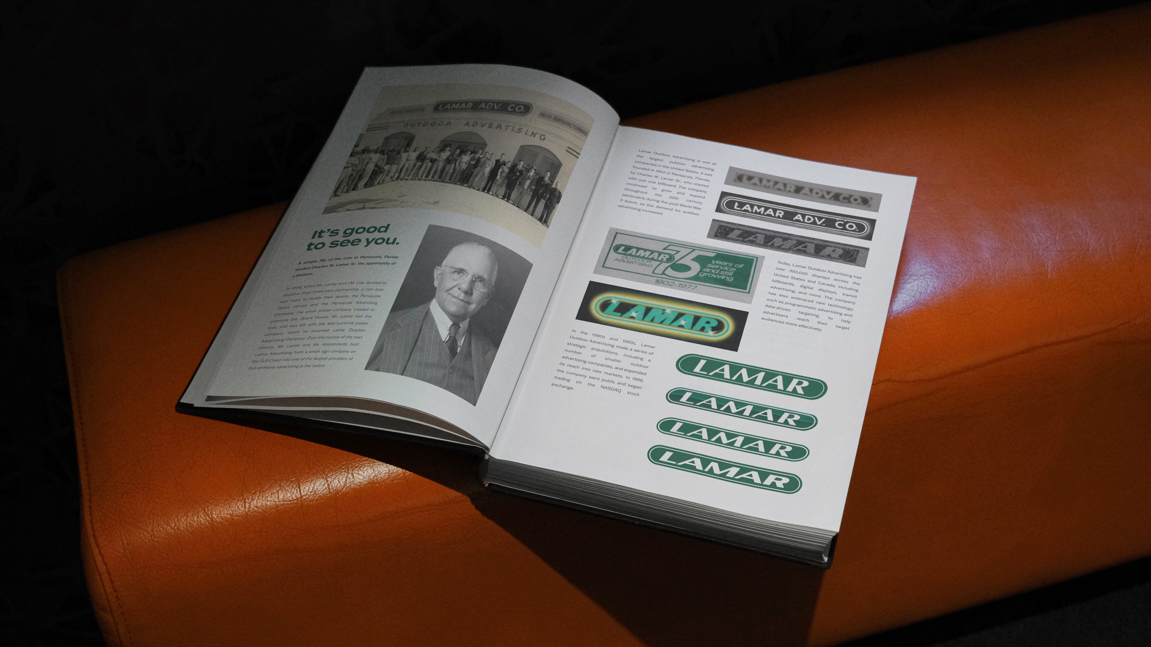
A small snippet of their extensive, 120-year (and counting) history.
We started with a 20-page logo audit, deciphering a century of design choices to help the team see the shape of its next chapter.
The 20-page logo audit in question.
The subtle art of refining giants
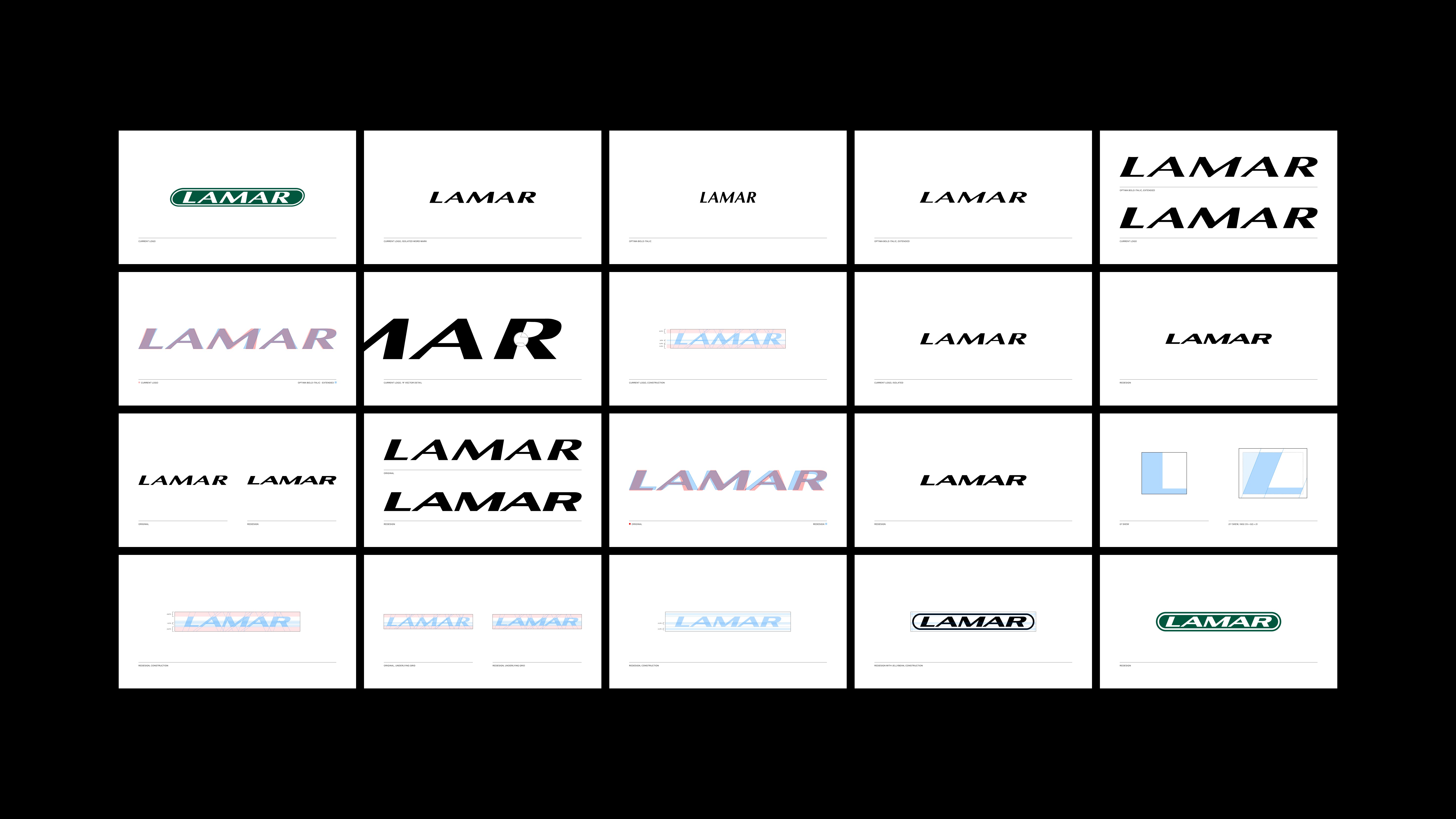
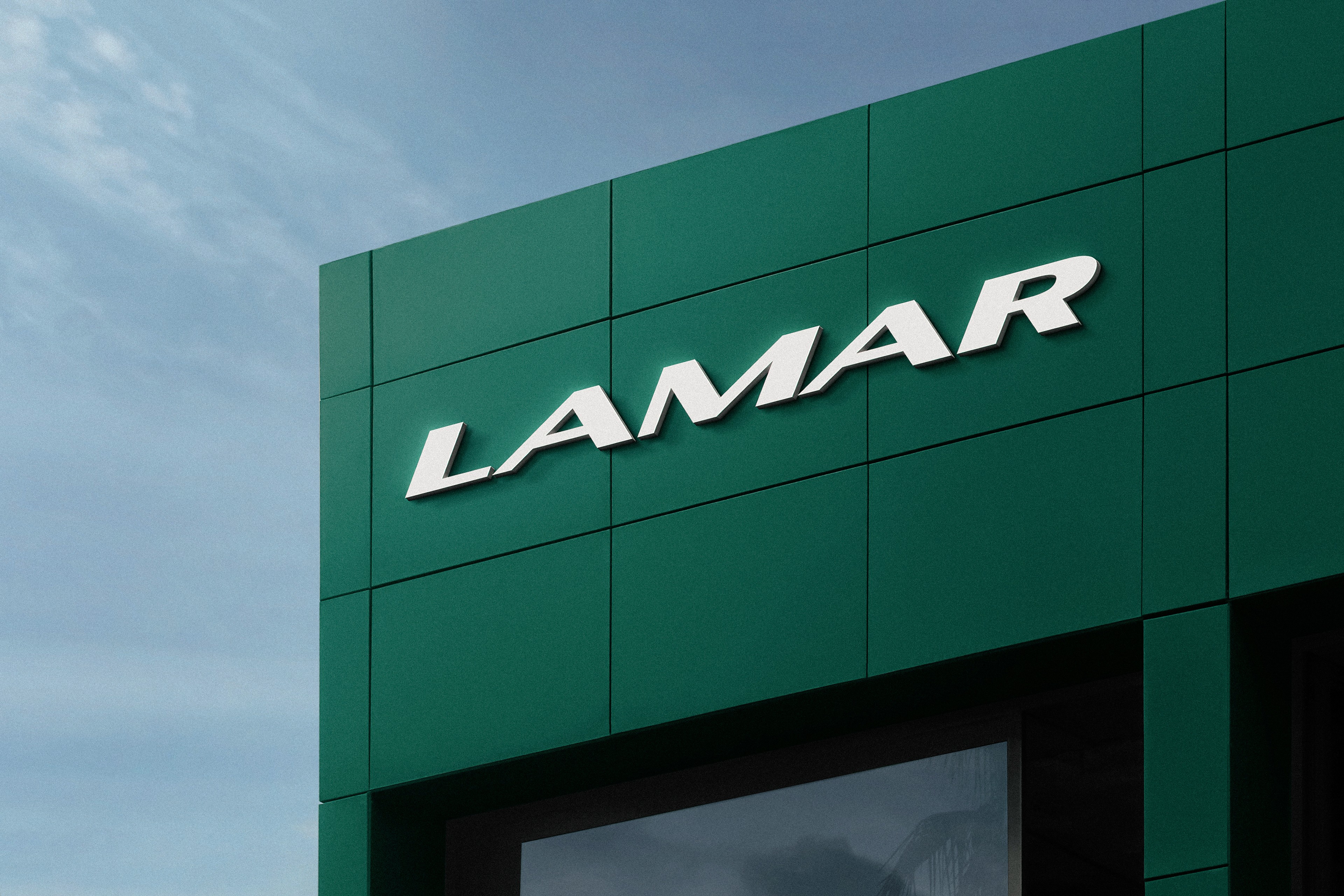
I promptly removed the mark from its iconic bounding shape, colloquially known as the “jellybean,” to focus on its letterforms.
After inspection, I discovered a mark eerily similar to Optima. Optima Bold Italic, to be exact, stretched a little too enthusiastically. A quick overlay confirmed it.
With that in mind, I redrew each letter from scratch, using Optima’s proportions and refining the skew to 21 degrees—an average of the original and a subtle nod to Lamar’s founding year, 1902 (19+02). I know, I know, but it felt like a fitting detail.
After a few rounds of kerning and bezier tweaks only a nerd would notice, the wordmark was ready.
Next came the jellybean. For the inner shape, I took cues from the crossbars—the horizontal strokes in letters like A and H—to set the width, then added concentric padding. The result felt heavy, so I cut the stroke in half. That gave the letters more breathing room and made the mark easier to scan at small sizes.
Et voilà: a refined jellybean.
Stroke width adjustment.
Before
After
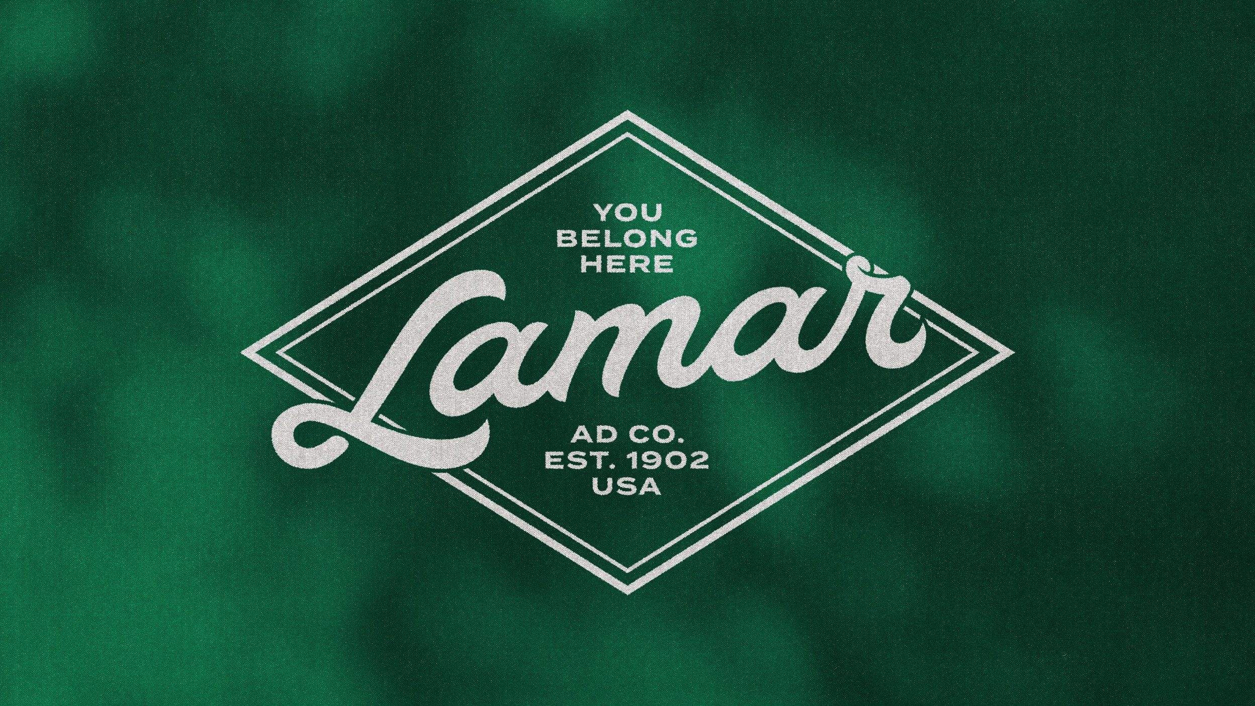
With the mark settled, we developed a simple lockup system to house their many corporate locations and subdivisions.
We also received a request for a mark without the jellybean for use on their corporate buildings. We obliged.
With the rest of the brand in front of us, our approach was clear: embrace heritage where possible, keep what works, and revisit what doesn’t. This became our modus operandi, letting us explore without losing sight of the plot.
The selected mood board out of two presented options.
A palette with roots
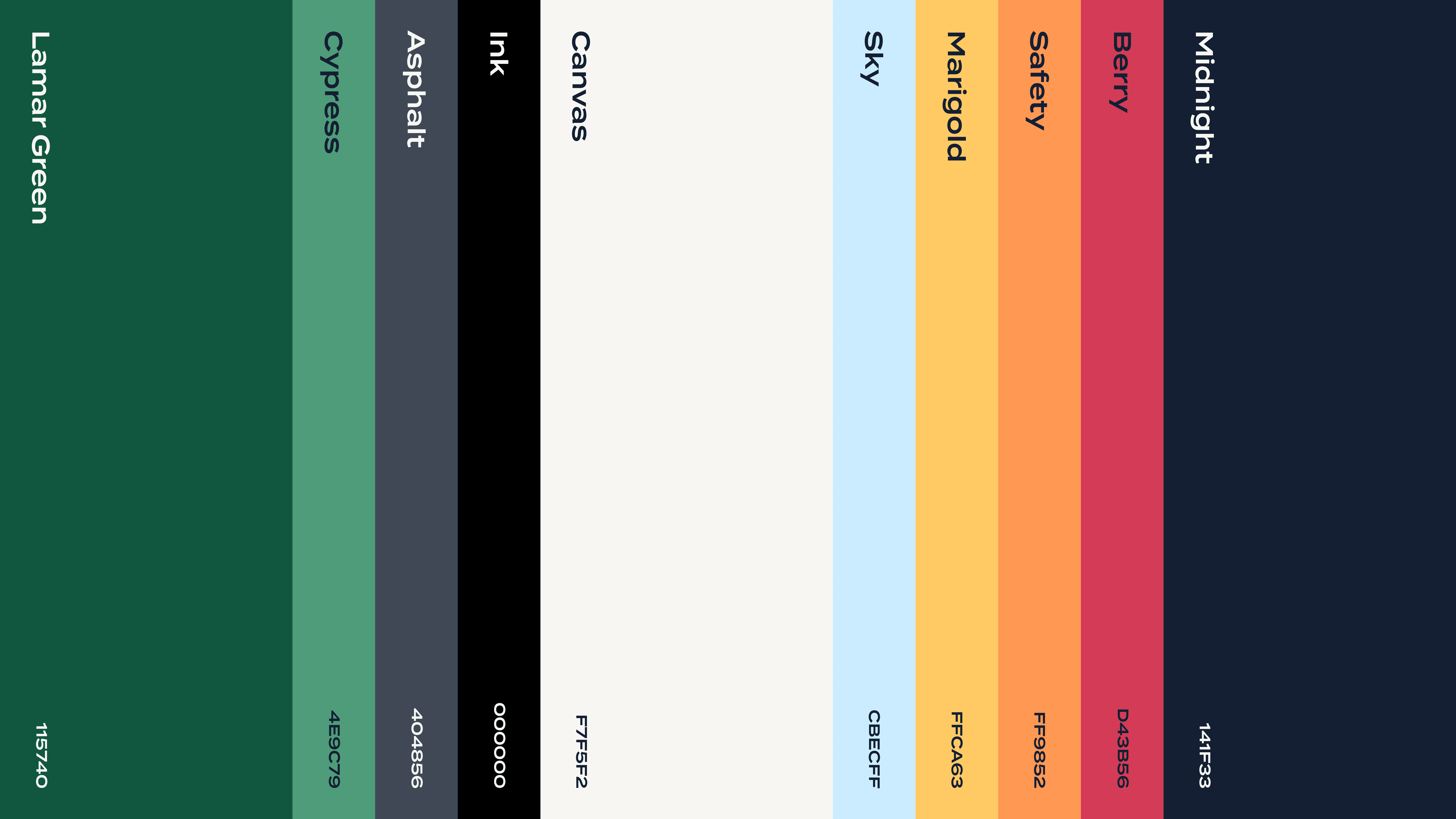
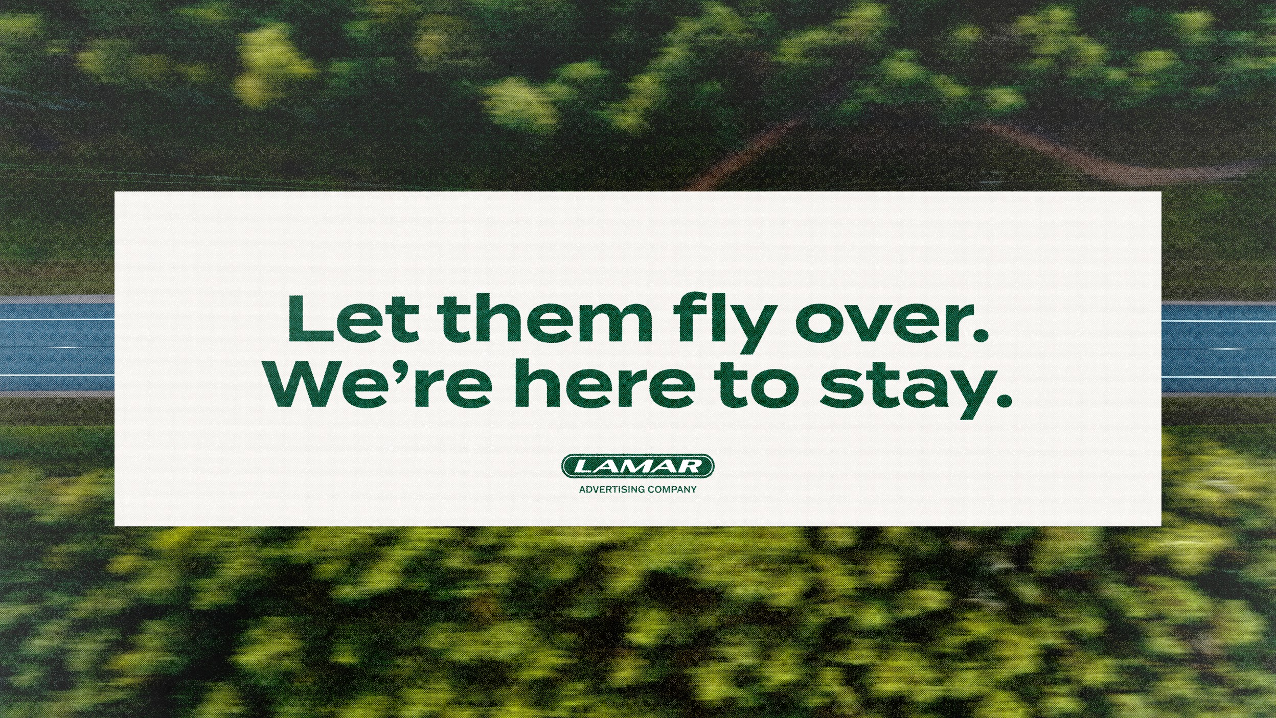
Changing their green was a non-starter (#115740 or bust). That restraint guided us through countless palettes before realizing the best answer was close to home: hues and names inspired by the places and people that make Lamar more than billboards.
Special mention to Magnolia, a nod to Louisiana’s state flower, and Safety, the orange drawn from the hard hats worn by Lamar billboard techs. Canvas recalls the very fabric of their displays, while Asphalt and Midnight capture the roads and skies they live against. Each swatch tells its own story, and together, they form a palette that’s unmistakably Lamar.
Finding the right voice
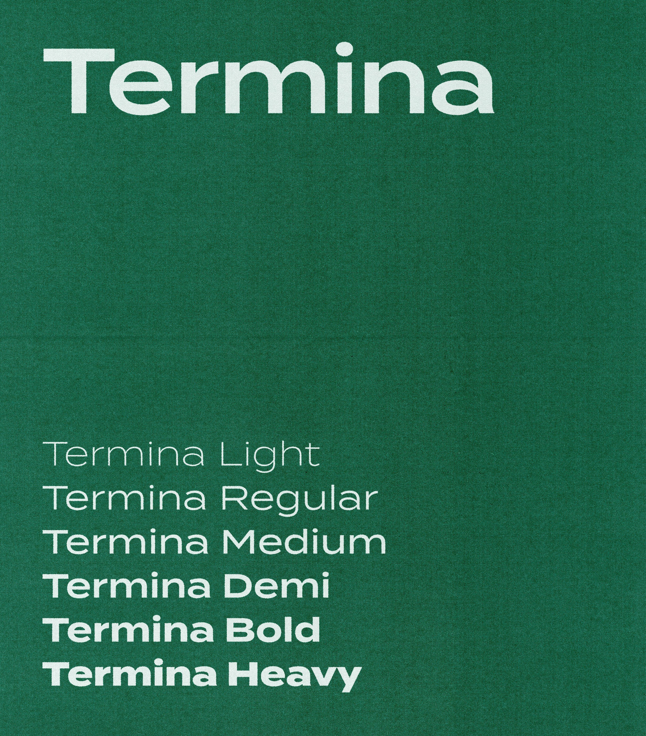
For our lead typeface, we needed something bold enough to keep pace with the mark, but not so much that it overstayed its welcome. Cue Termina. It’s unapologetically wide, confidently blocky, and able to raise its voice without sounding obnoxious.
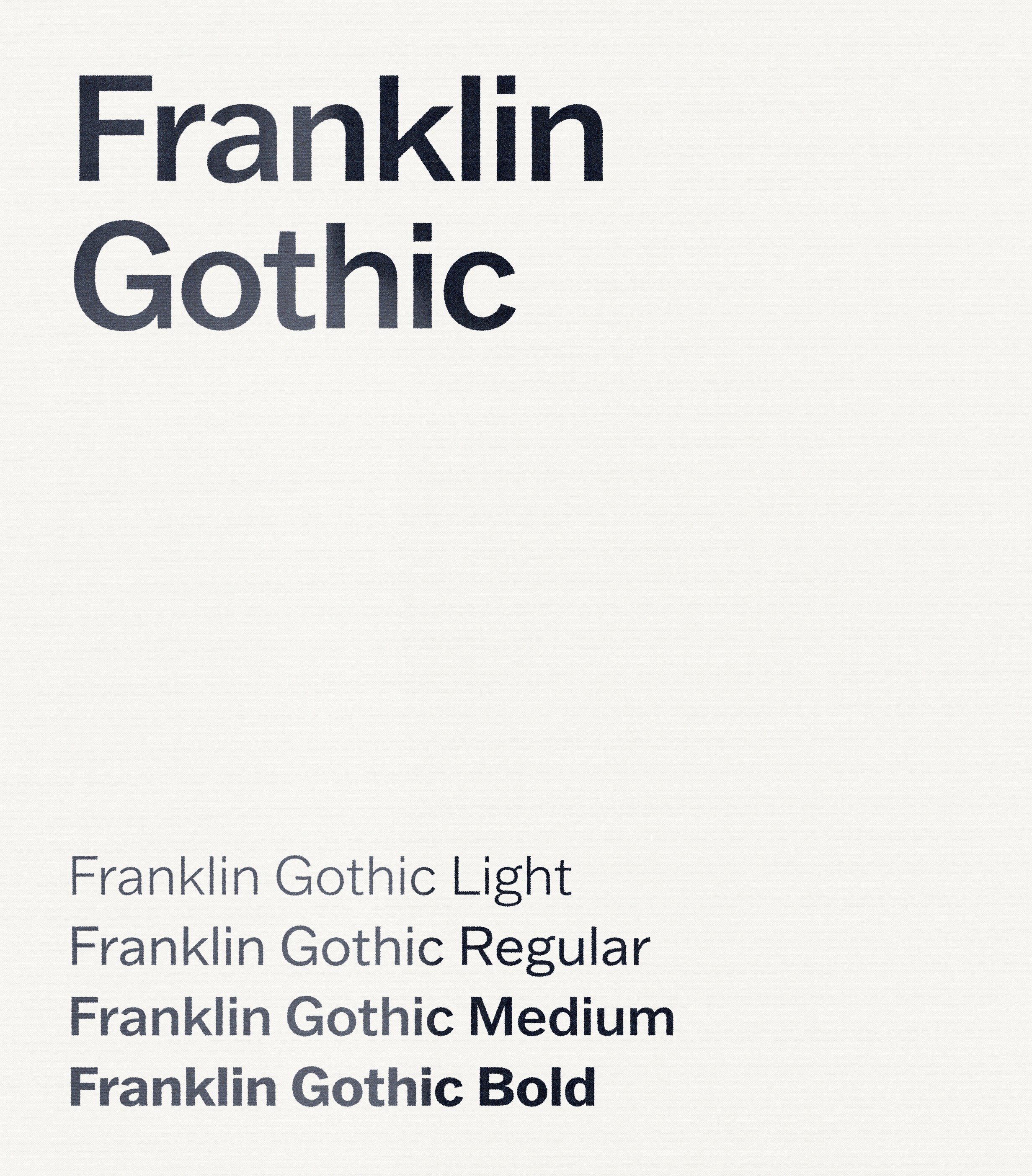
To balance Termina’s personality, our supporting typeface had to be neutral. Reliable. Something with Helvetica’s rapport, but a touch more character. Cue Franklin Gothic. A workhorse sans born the same year as Lamar, the choice was almost too perfect. Hey, if it’s lasted a century, it’ll last another.
Termina in use.
3-column pamphlet template.
A turn toward character
With our core elements set, we took another look at our mood board and let a dangerous question slip:
“What if Lamar went full kitschy Americana?”
An idea this big rarely takes off mid-project, but our extraordinary in-house illustrators overheard. Equally curious, it wasn’t long before we sketched the first lines of a brand mascot.
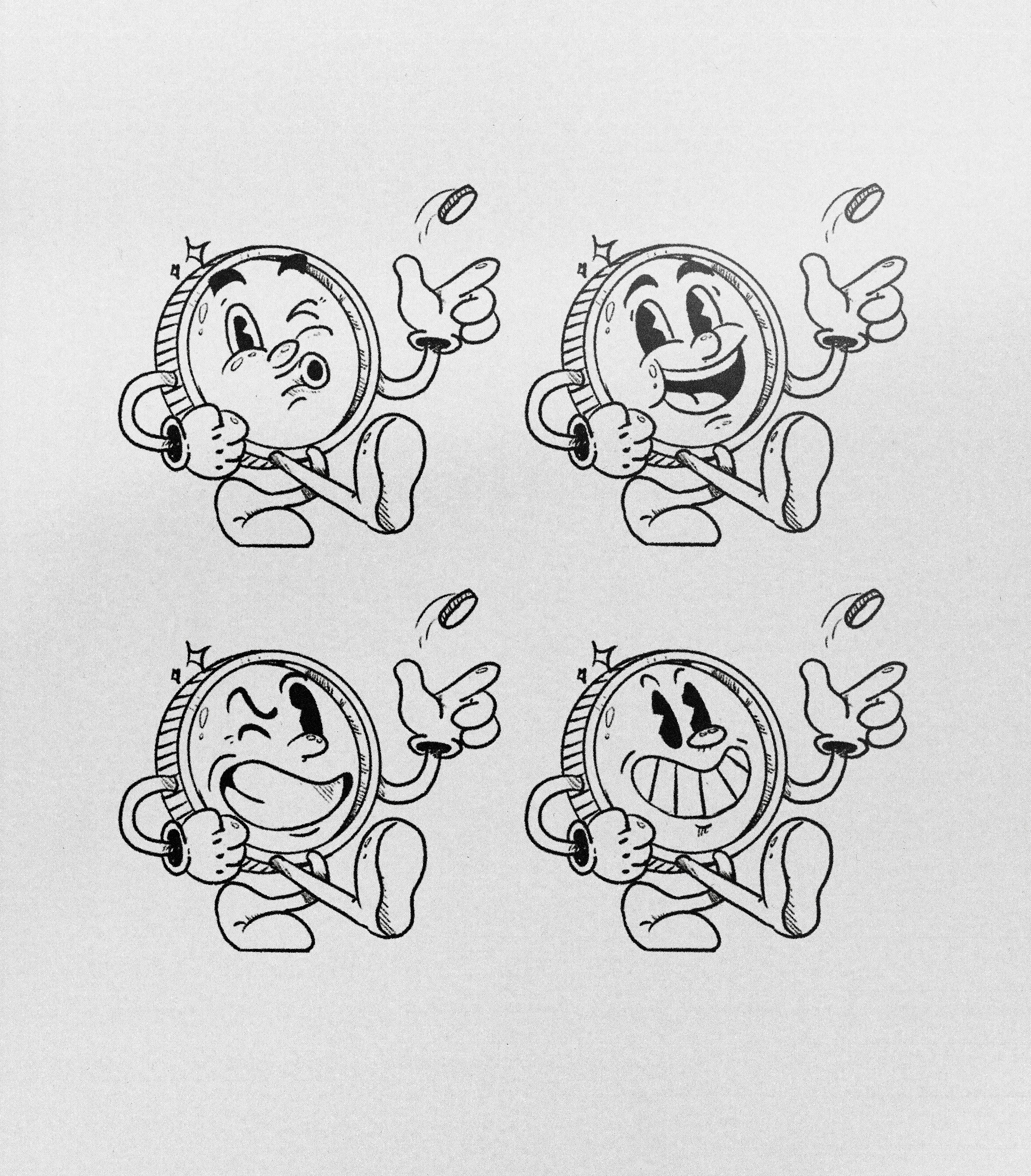
Original concept and high-fidelity sketches.
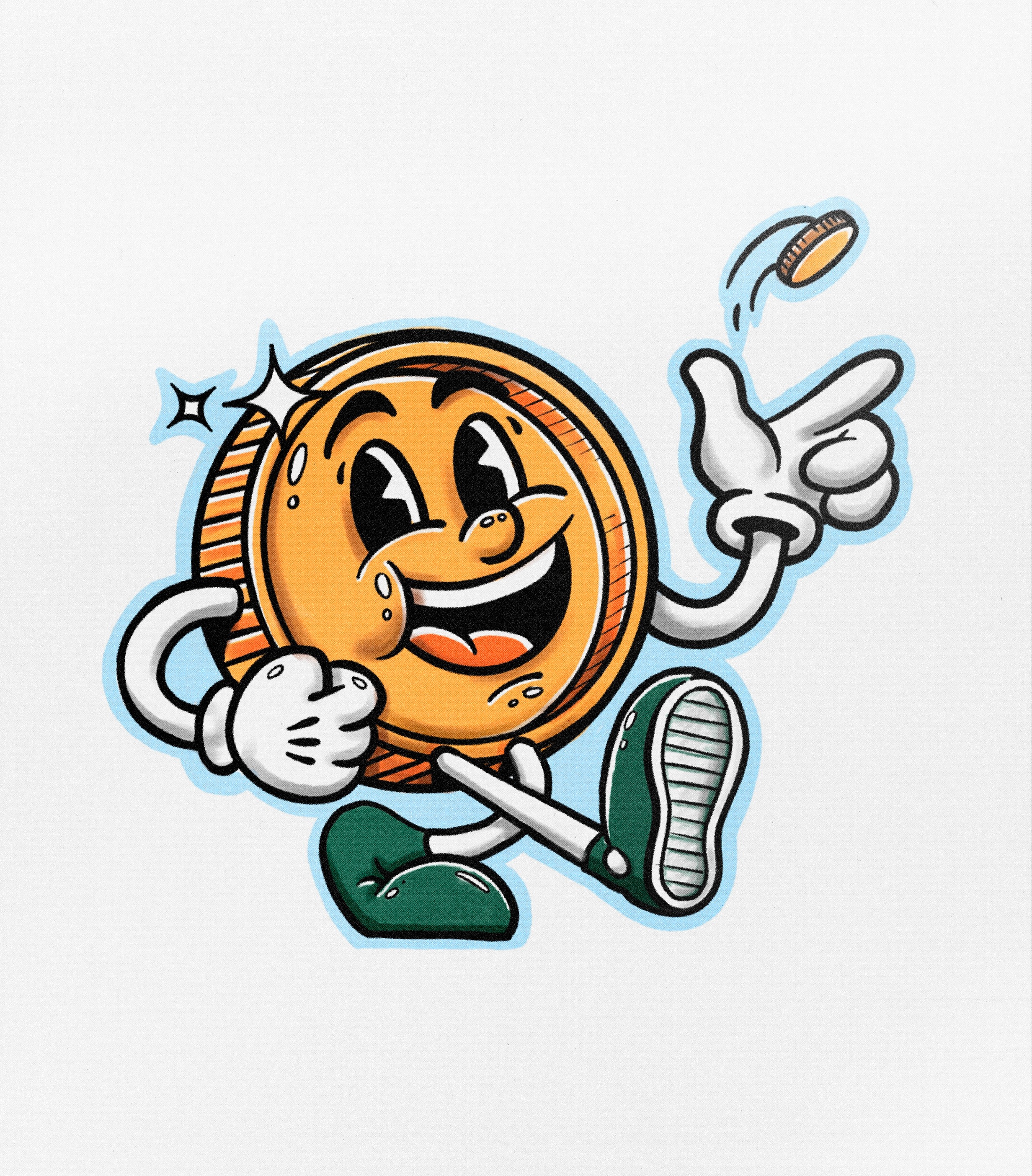
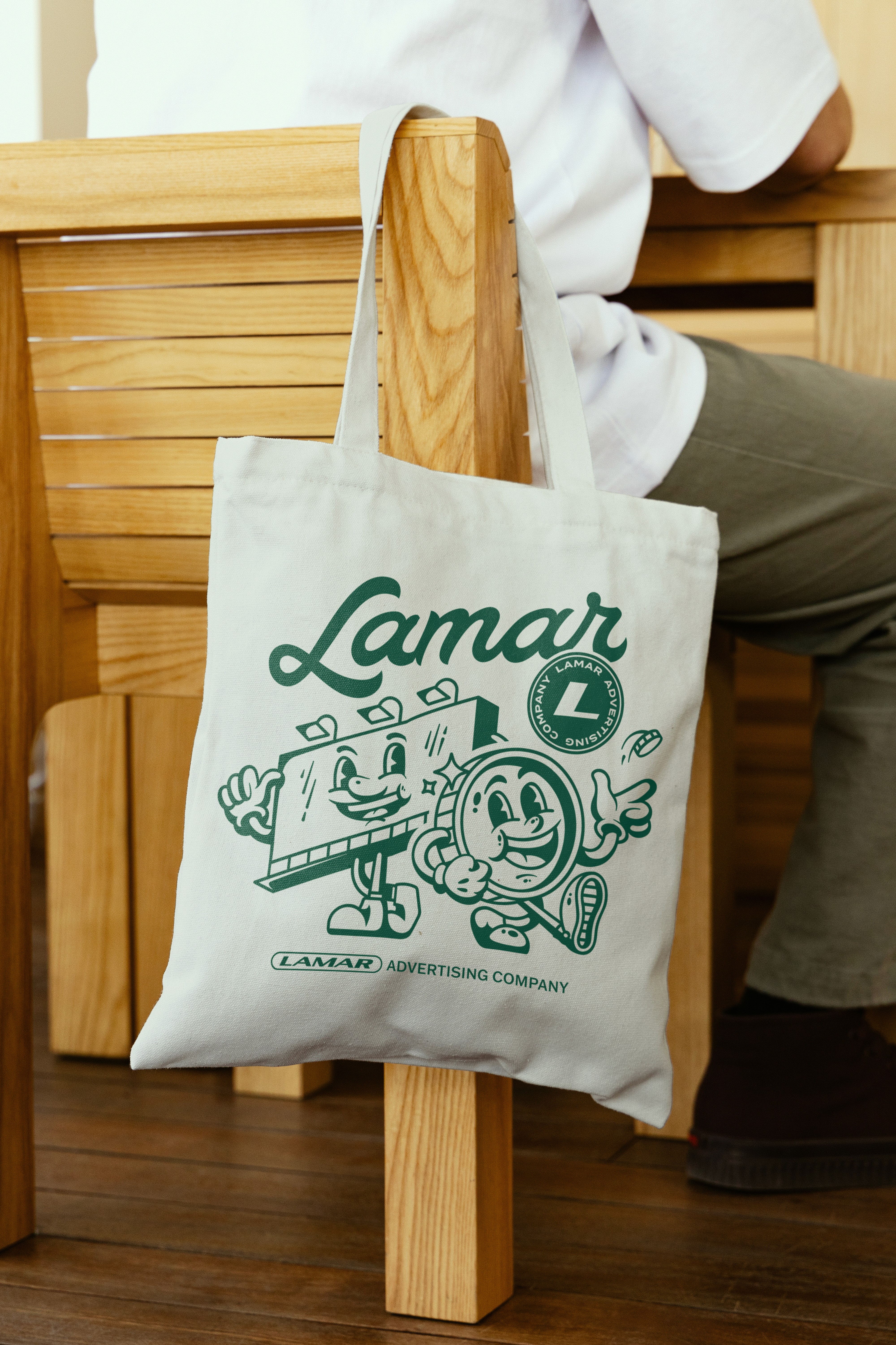
A penny flipping a penny. That’s what we came up with. Meet Lenny the Penny, inspired by the infamous coin toss that won Charles W. Lamar the company we know today. I love a good origin story.
We drew Lenny in the rubber hose style, the bouncy look popularized by early twentieth-century animation. It felt both period-correct and time-agnostic.
When we introduced Lenny to the Lamar team, they were an instant hit. So we made another one, because every penny deserves a pal: a billboard named Billy.
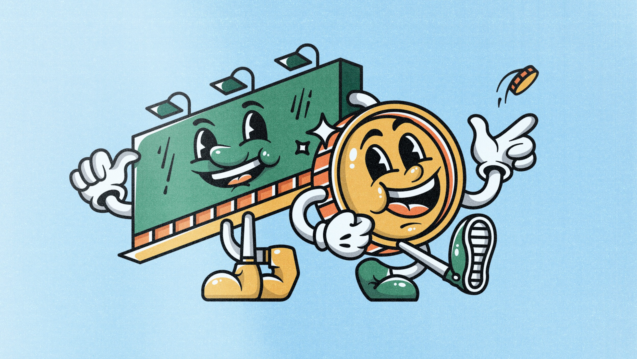
Billy (left) and Lenny (right), the brand’s dynamic duo.
We were thrilled with the brand’s new companions. Lenny serves as the playful link to Lamar’s origins, while Billy grounds the pair as a literal representation of the brand. Together, they proved our hunch: Lamar’s history could be translated into something both unexpected and true to its roots.
Crafting the script
Fueled by a mix of validation and zest, we regrouped to focus our momentum. That’s when I learned my partner in crime, the wildly talented Mike Jones, had a background in hand lettering. Based in Columbus, Georgia, and deeply passionate about vintage design, Mike’s work carries a Southern charm and warmth that pairs perfectly with our mascots. So we channeled our inner Mason jar and set out to create a custom script logo.
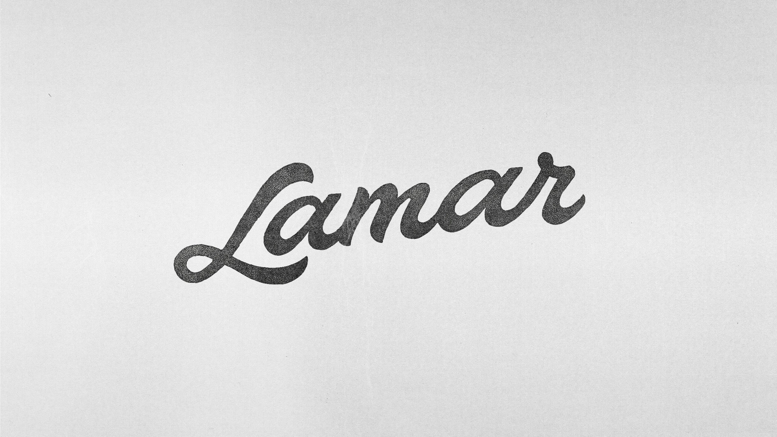
Mike’s initial sketch.
Unsurprisingly, Mike nailed it. I couldn’t have asked for a better first sketch; it looked final. Thankfully, it wasn’t, which gave me a day with the pen tool to smooth over its letterforms and proportions.
The finalized vector, coined the “Heritage Script.”
The joy of indulgence
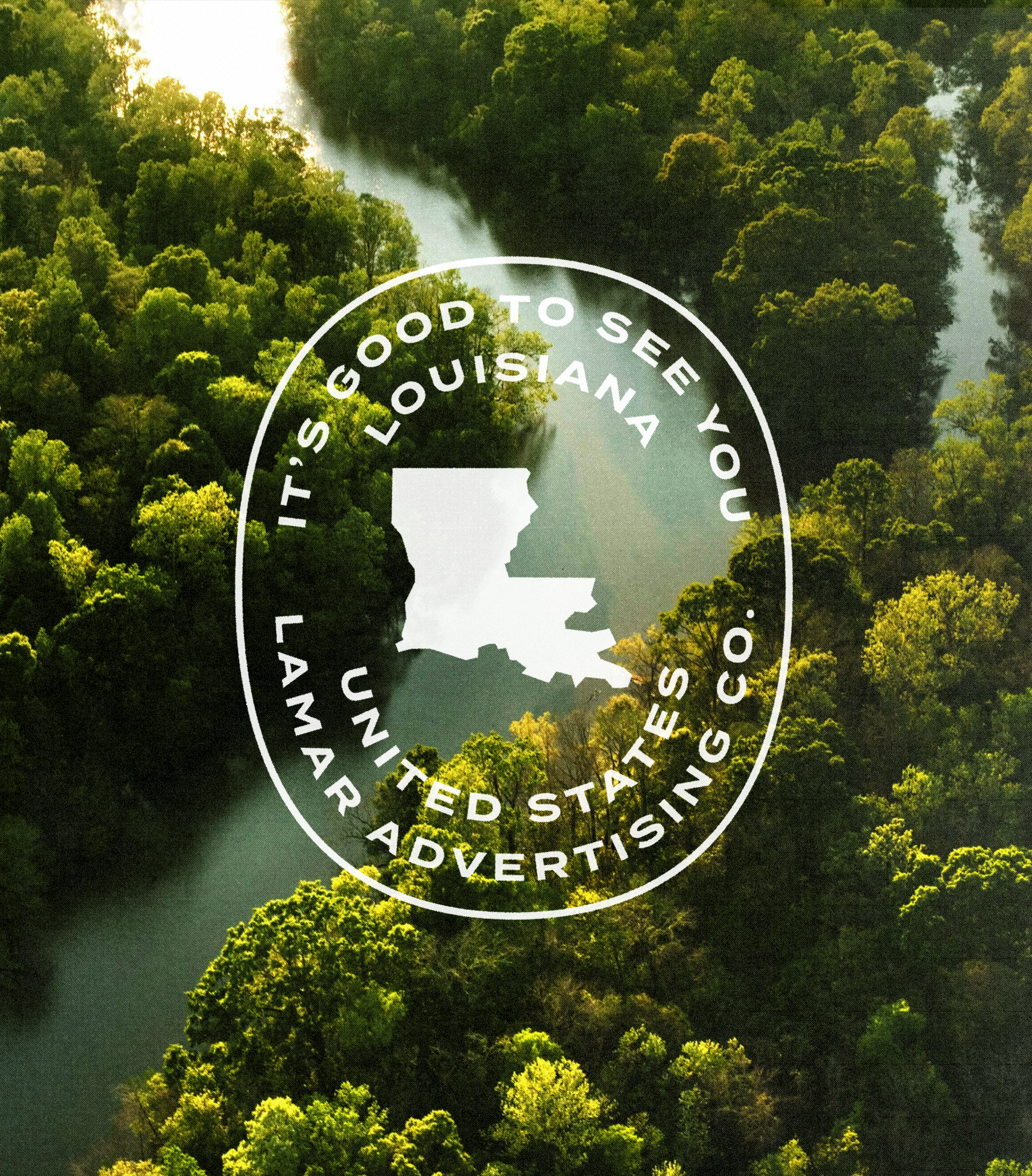
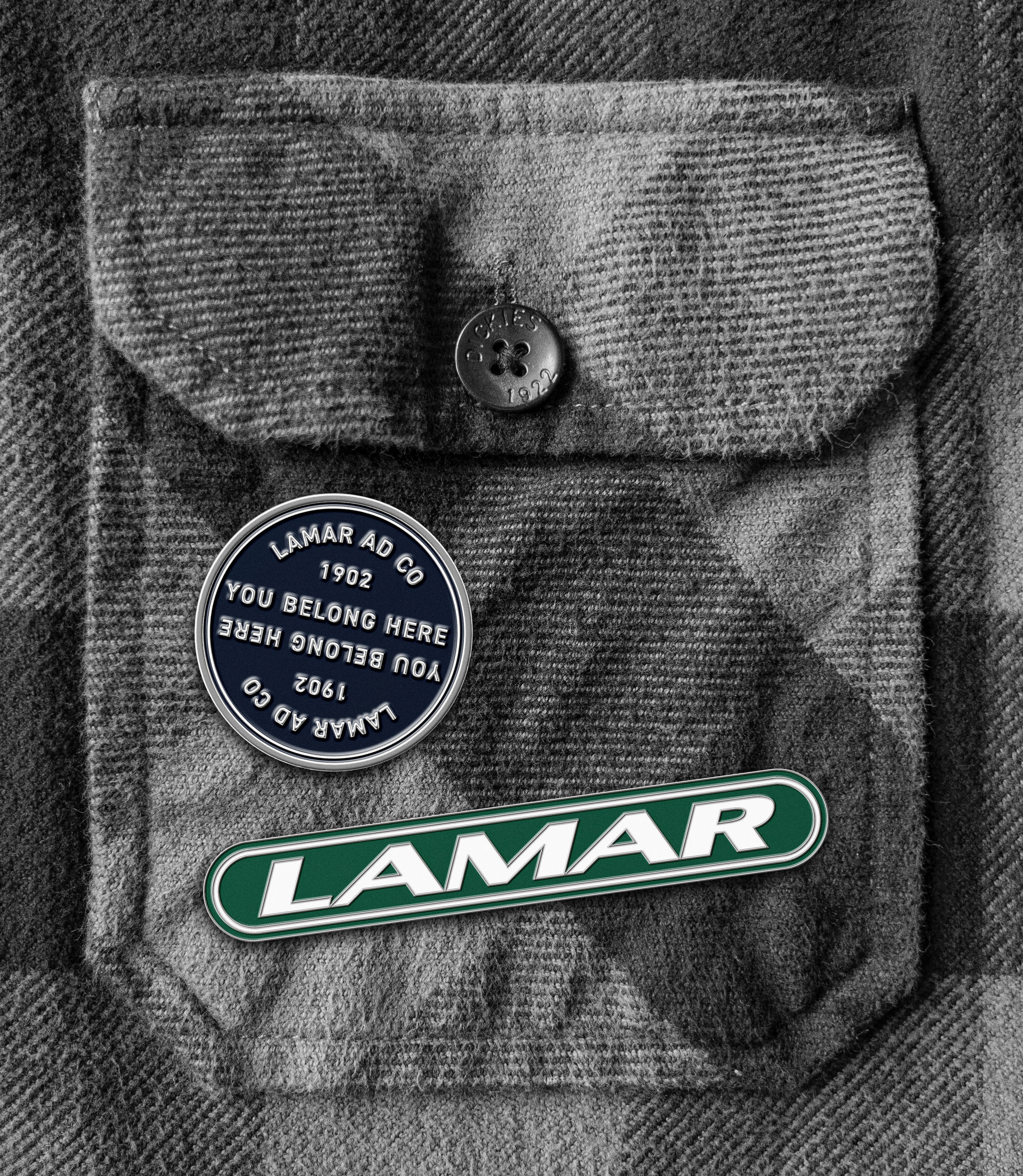
The script was also a hit, so we pushed our luck with one last idea to tie it all together: badges. Lots of ‘em.
It was total madness. We let our imaginations loose, chasing one concept after another, flowing from one asset to the next. It was pure design bliss. Did we go overboard? Probably. But was it worth it? Absolutely.
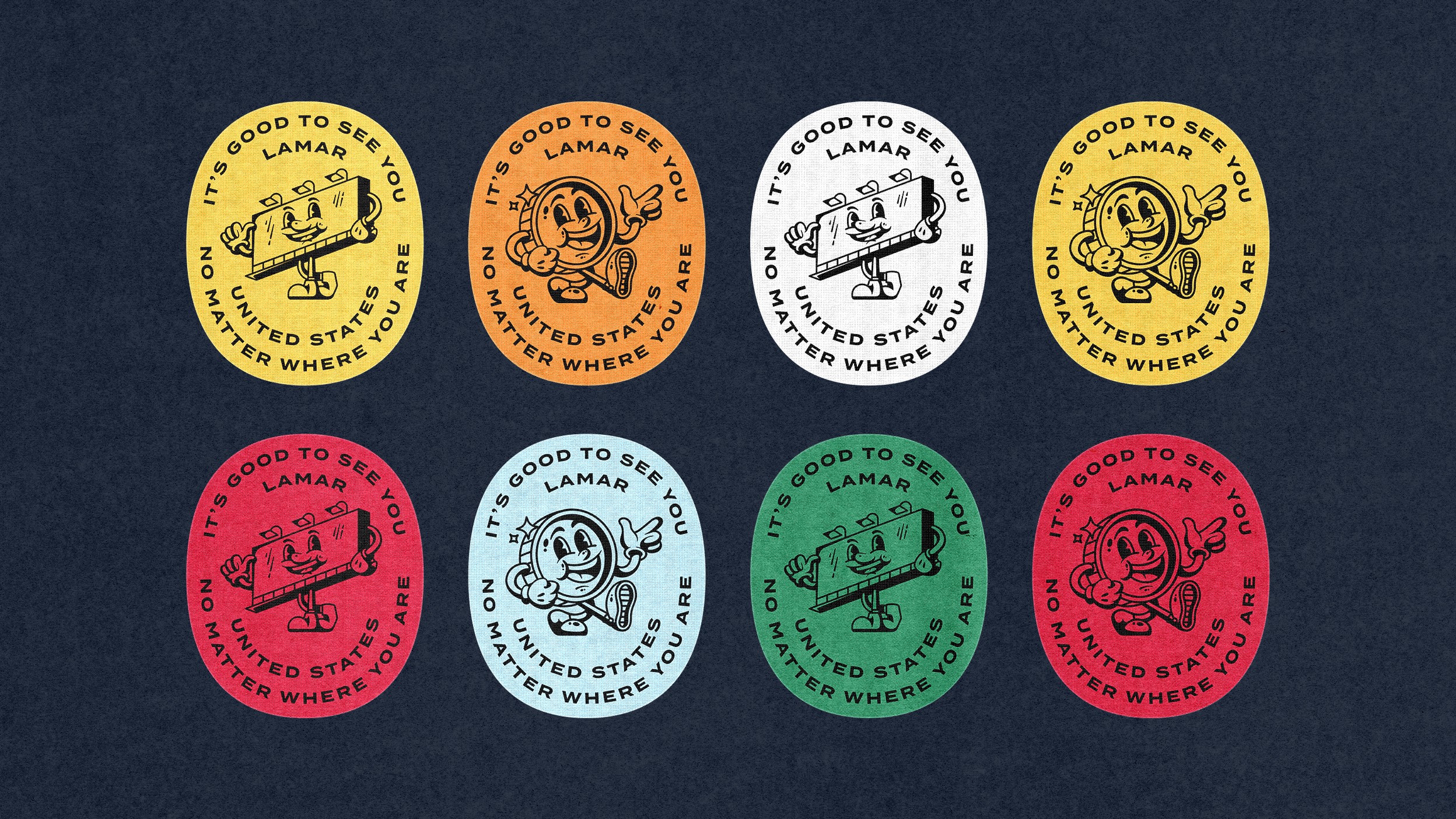
Colored slogan badges featuring Lenny and Billy.
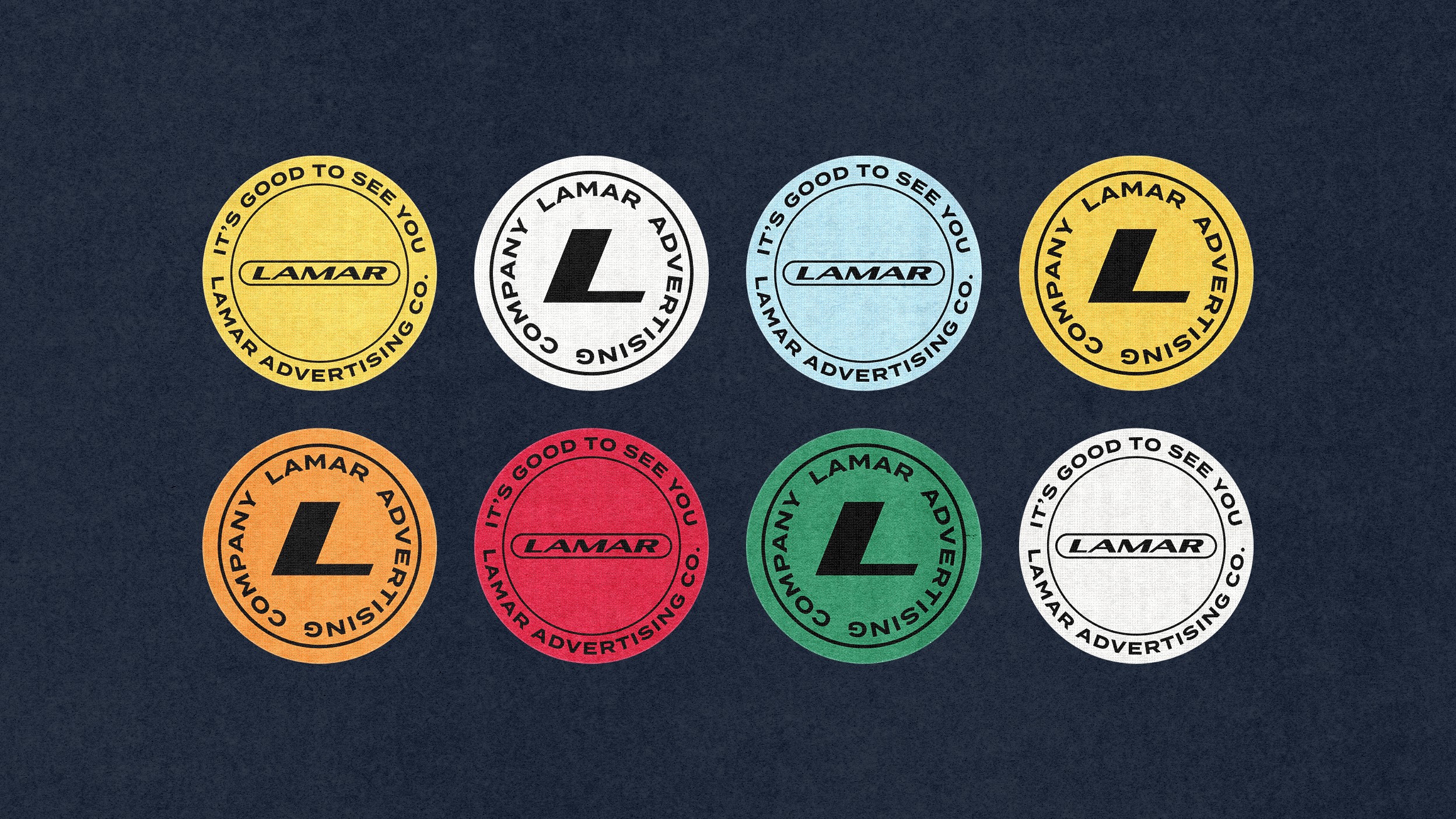
Colored core badges for more corporate applications.
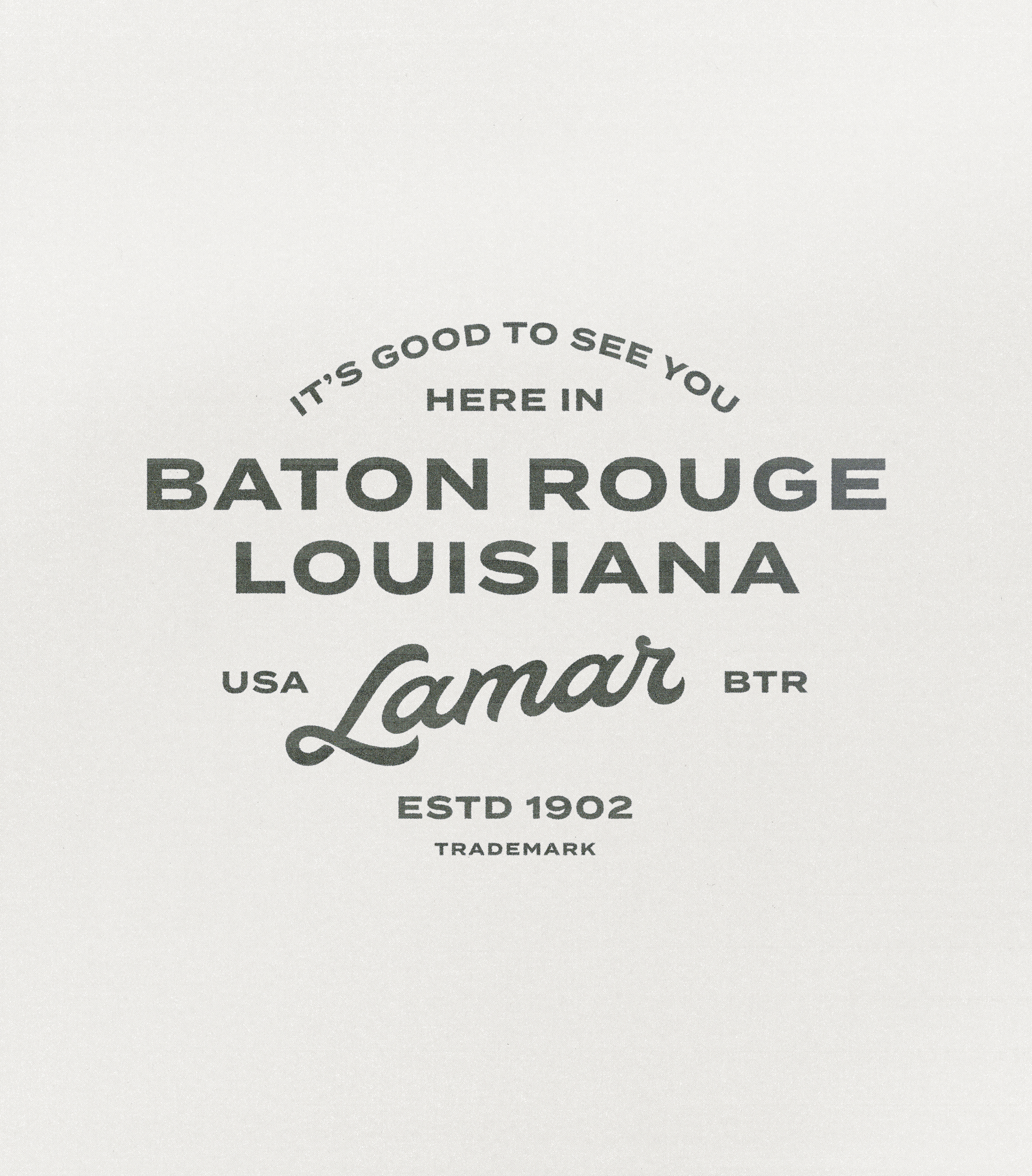
We created a small set of location-based badges for the marketing team to build on over time: Baton Rouge for their headquarters, Sarasota because it’s a pretty word, and Los Angeles because it’s home. Sometimes design choices are that simple.
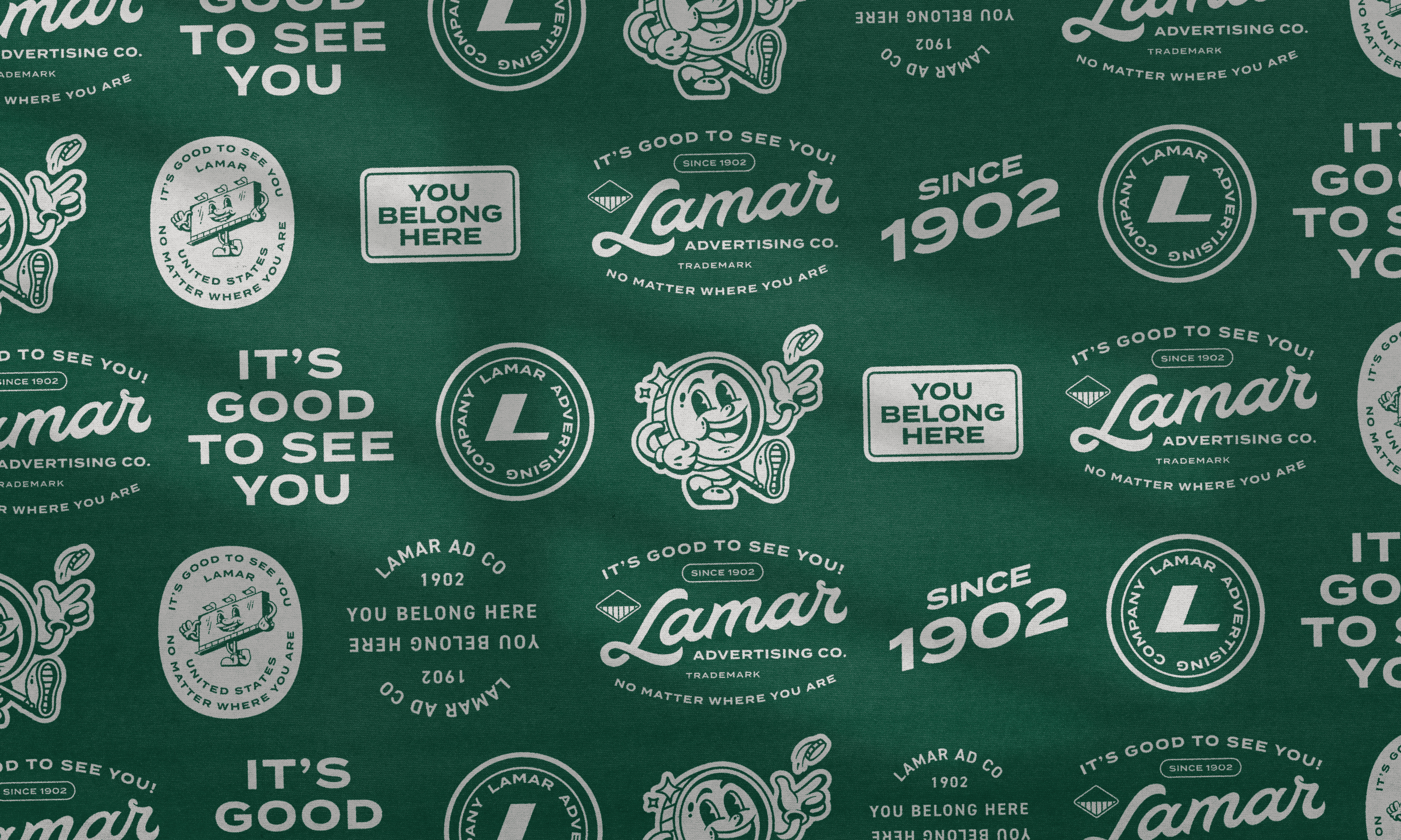
A badge-bombed step-and-repeat pattern, because why not?
Between tradition and play
When we finally emerged from our badge-induced fever dream, we found a set of assets and applications so playful it was hard to believe they were made for a billboard company.
The team was ecstatic. It wasn’t the path we (or anyone, really) expected to take, but that’s precisely what made it memorable. It proved the value of taking calculated risks, trusting the process, and having fun along the way.
What started as an engagement for social media materials turned into a refresh with two distinct personalities. One, with its careful refinements, respected the stability of a century-old company. The other celebrated its roots with a vintage appeal that pulled its past into the spotlight. Together, they gave Lamar a timeless toolkit to both button up and loosen its tie.
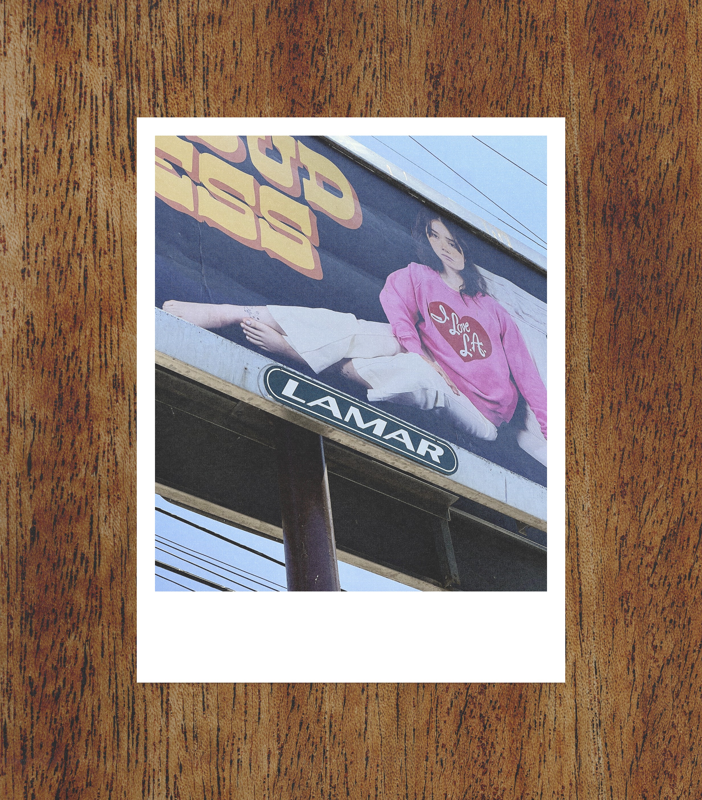
Updated billboard I spotted during a bike ride in Los Angeles.
Full circle
Three years later, I still can’t pass a Lamar billboard without smiling. It’s the project I’m most proud of, and it only became possible thanks to the incredible team and creative partners at Lamar who trusted us, embraced the crazy ideas, and brought it to life.