Redesigning a mobile app where one input error voids legal work.
Overview
Thousands of process servers rely on Proof to complete time-sensitive legal work in the field. The mobile app supports claiming, managing, and completing service jobs uploaded by firms, where clarity, reliability, and speed directly affect real-world outcomes.
But rapid growth outpaced our ability to maintain that clarity. Patterns, hierarchies, and interactions shifted with each release, reflecting a process optimized for execution speed over consistency.
This hit attempt recording the hardest. A single input error could invalidate an entire service and render the affidavit legally void, forcing ops teams to manually verify submissions. Tickets climbed, turnaround times slowed, and trust with firms eroded.


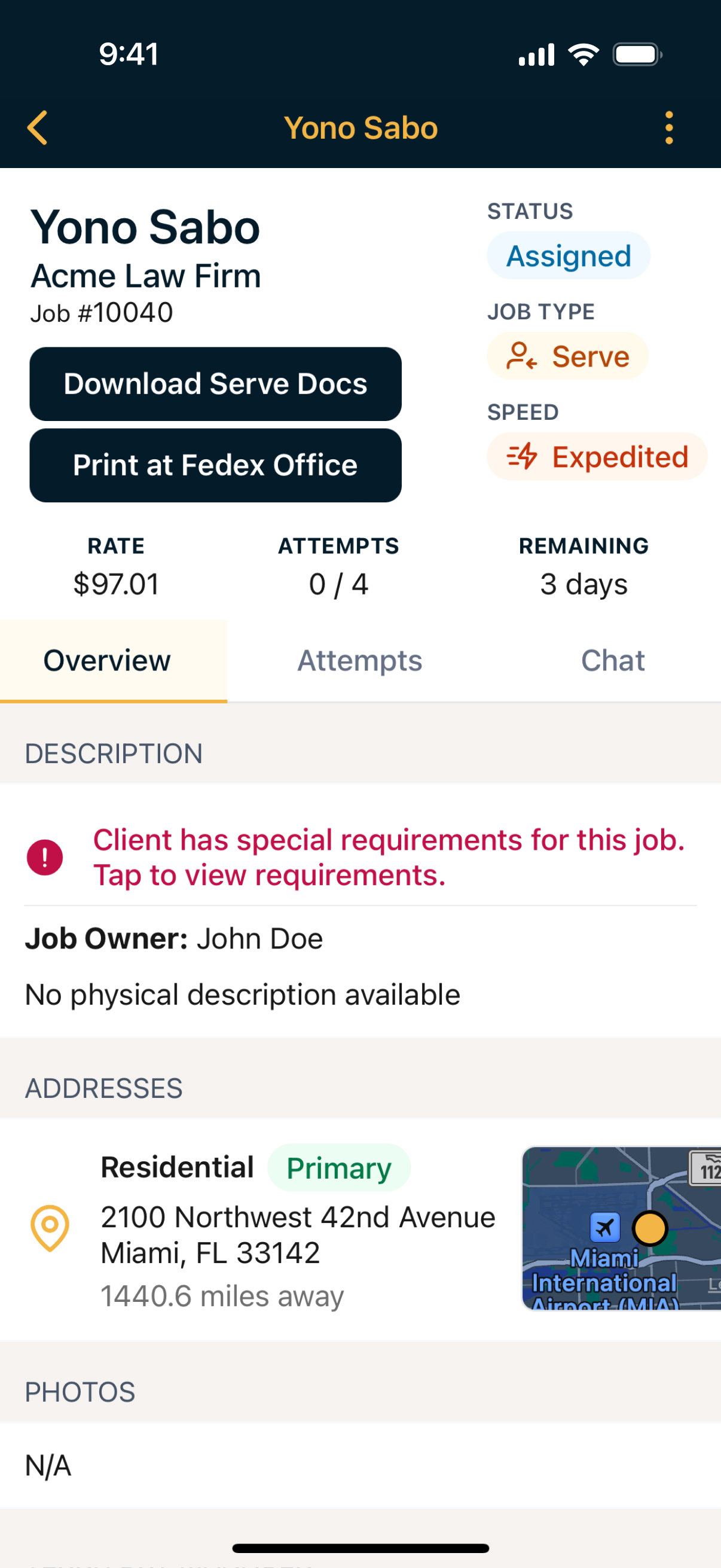
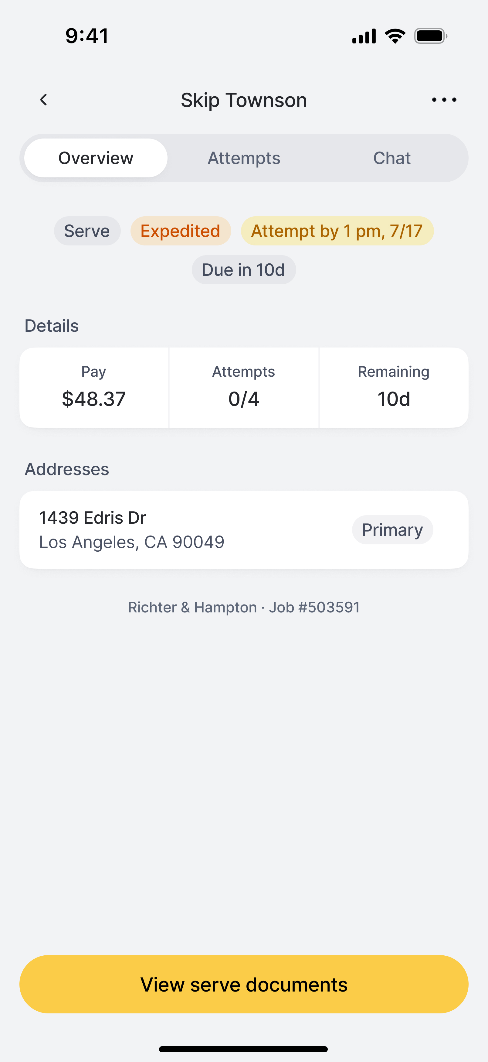
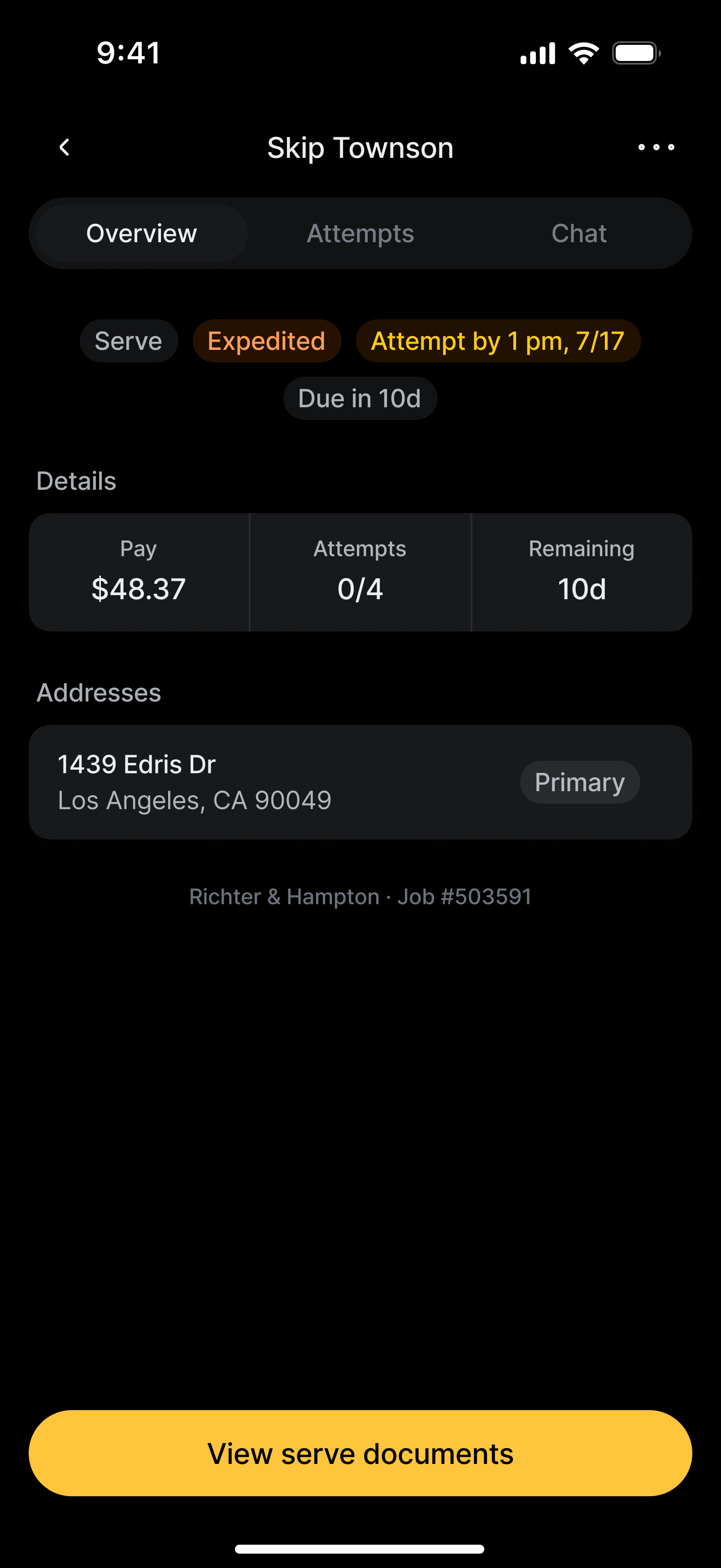
Servers experienced similar friction in job discovery and job details. Buttons competed for attention, information density obscured what mattered, and feedback was either overwhelming or missing entirely.


Servers wasted time parsing information that should have been instant, losing opportunities in a competitive market.


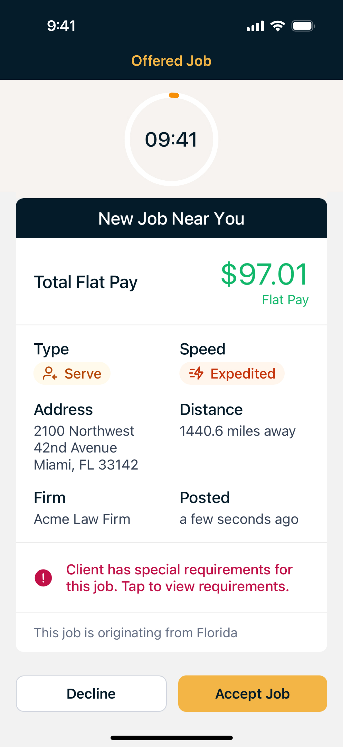
Job offers compounded the issue, infamously bringing work to a halt. Full-screen takeovers forced immediate decisions, broke concentration, and made it impossible to compare opportunities.


Principles
We rebuilt the app in six months without pausing releases or dropping support for legacy devices. To ensure consistency at pace, I created Compass, a mobile design system built specifically for this effort.
We focused on improving the highest-impact workflows first: discovery, offers, and attempt recording. Three simple directives guided our work:
Consistency over one-offs. Build muscle memory and trust through shared patterns.
Clarity over density. Surface primary actions and make the next step obvious.
Feedback, not noise. Confirm intent and communicate progress without distraction.
Solutions
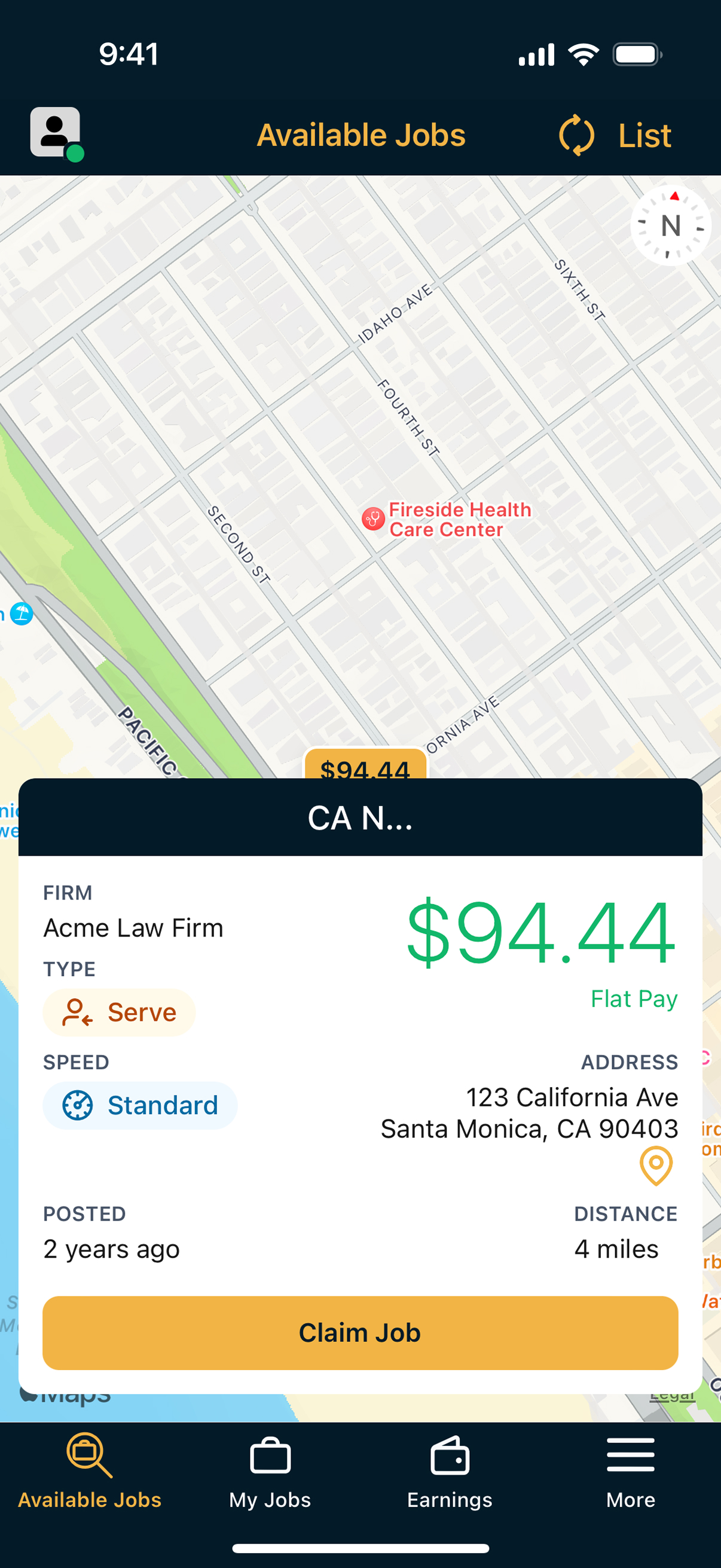
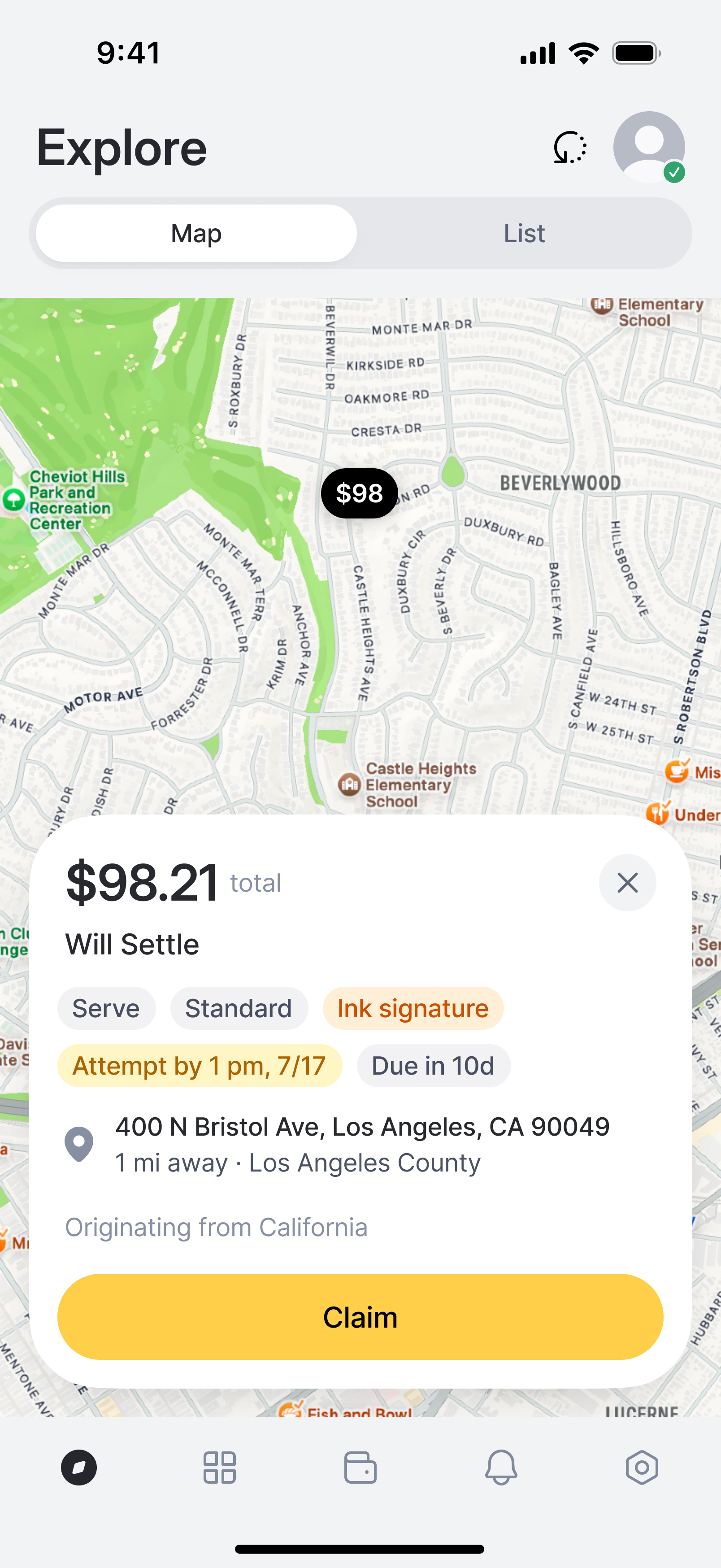
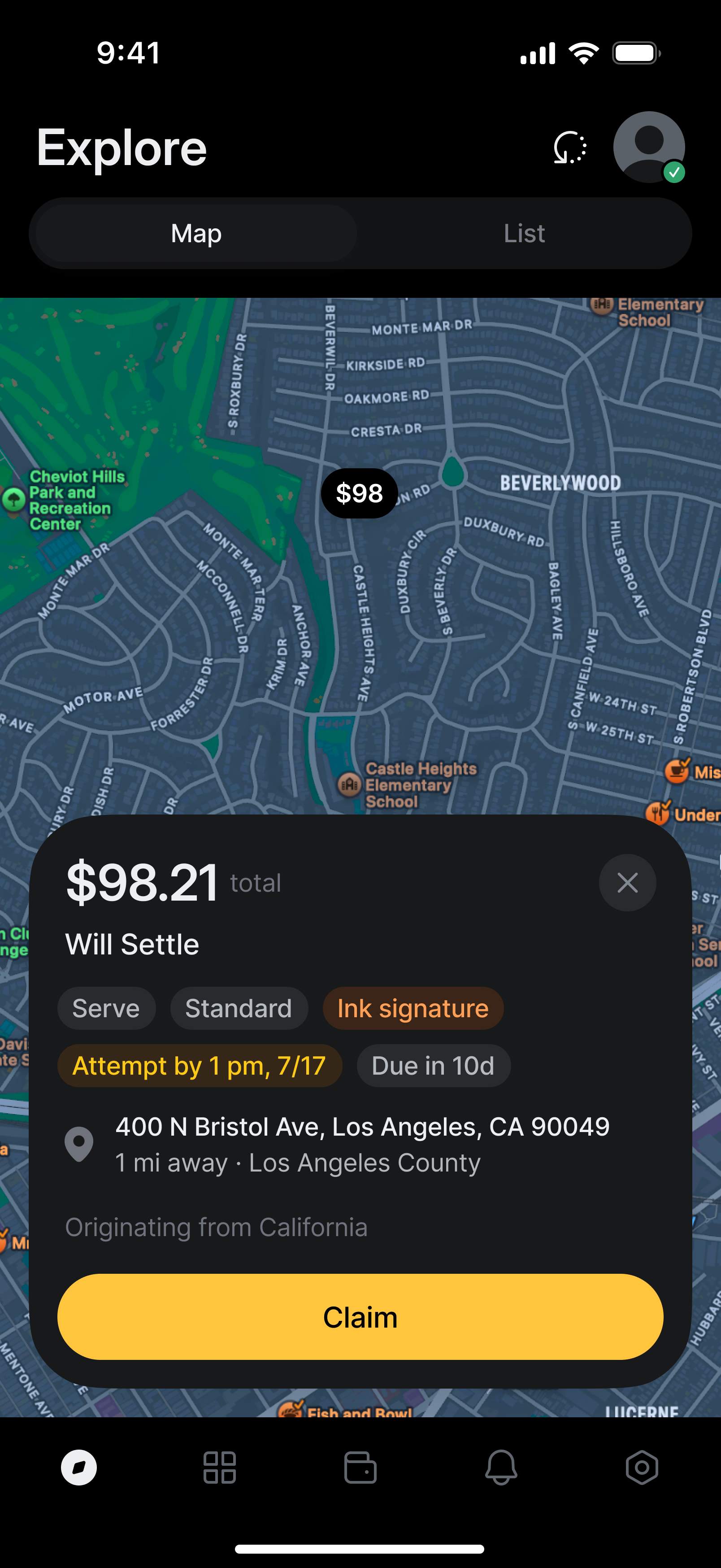
We started with Explore. Servers land here first and return constantly, so changes had to respect muscle memory while scaling to enable higher volume.
We reorganized the job card for decision speed, surfacing cost and constraints immediately, with location and context available at a glance.
Claiming a job now takes seconds without breaking flow.


Expectations clear before commitment, next steps immediate.
Job offers introduced a different problem: interruption. Full-screen takeovers pulled servers out of active work, even when offers were worth considering.
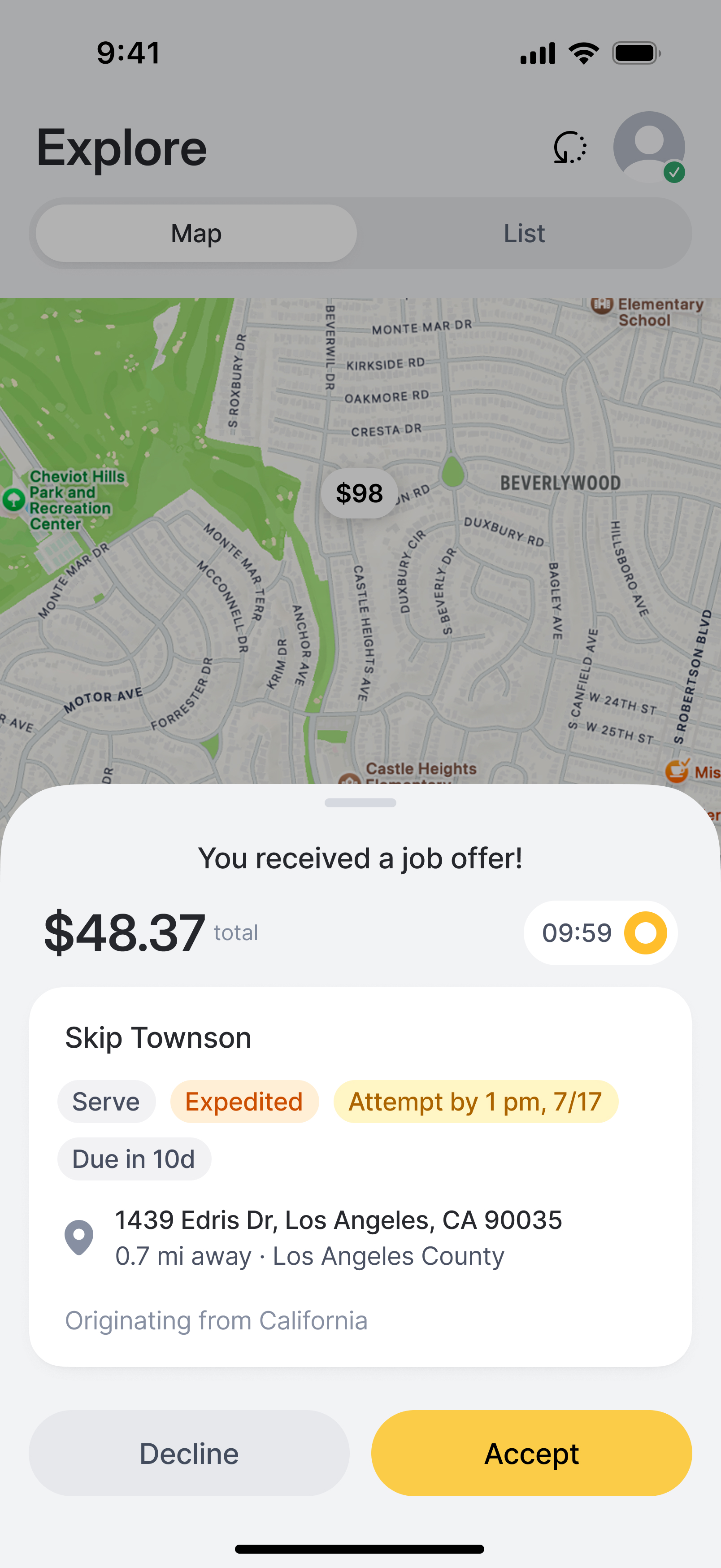
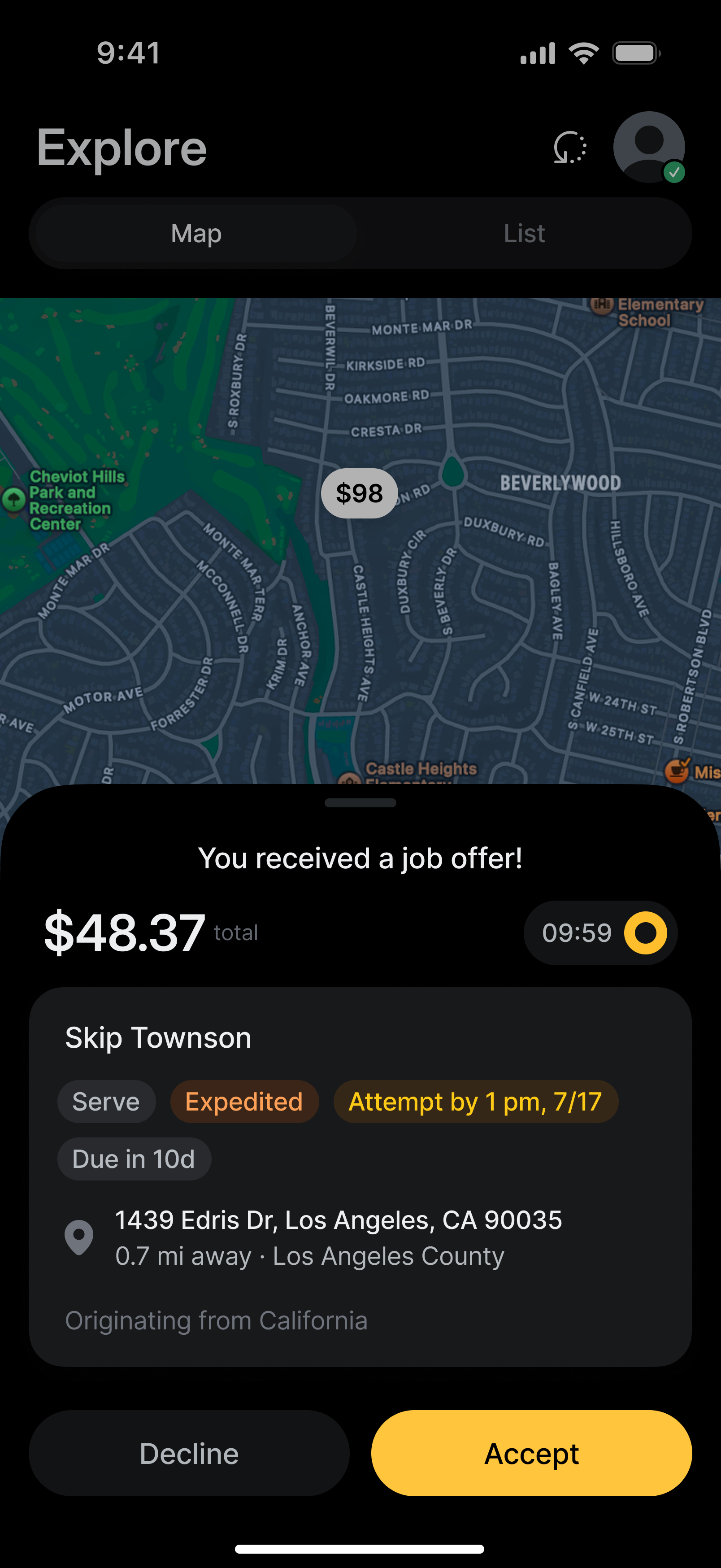
We replaced them with a collapsible drawer that appears anywhere in the app, preserving momentum while allowing quick comparison between opportunities.
Servers can now review offers in-context without disrupting active work.


Review offers without leaving the current task.
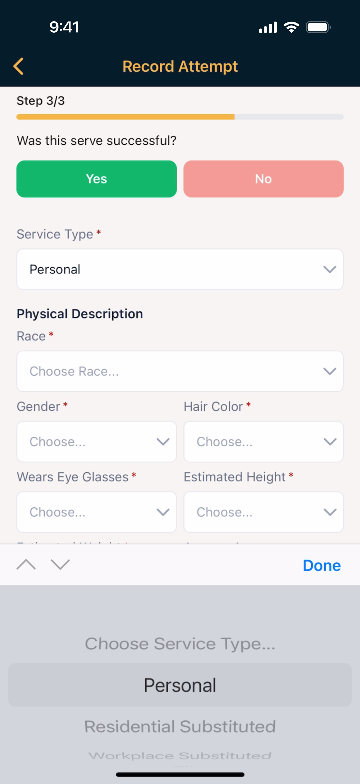
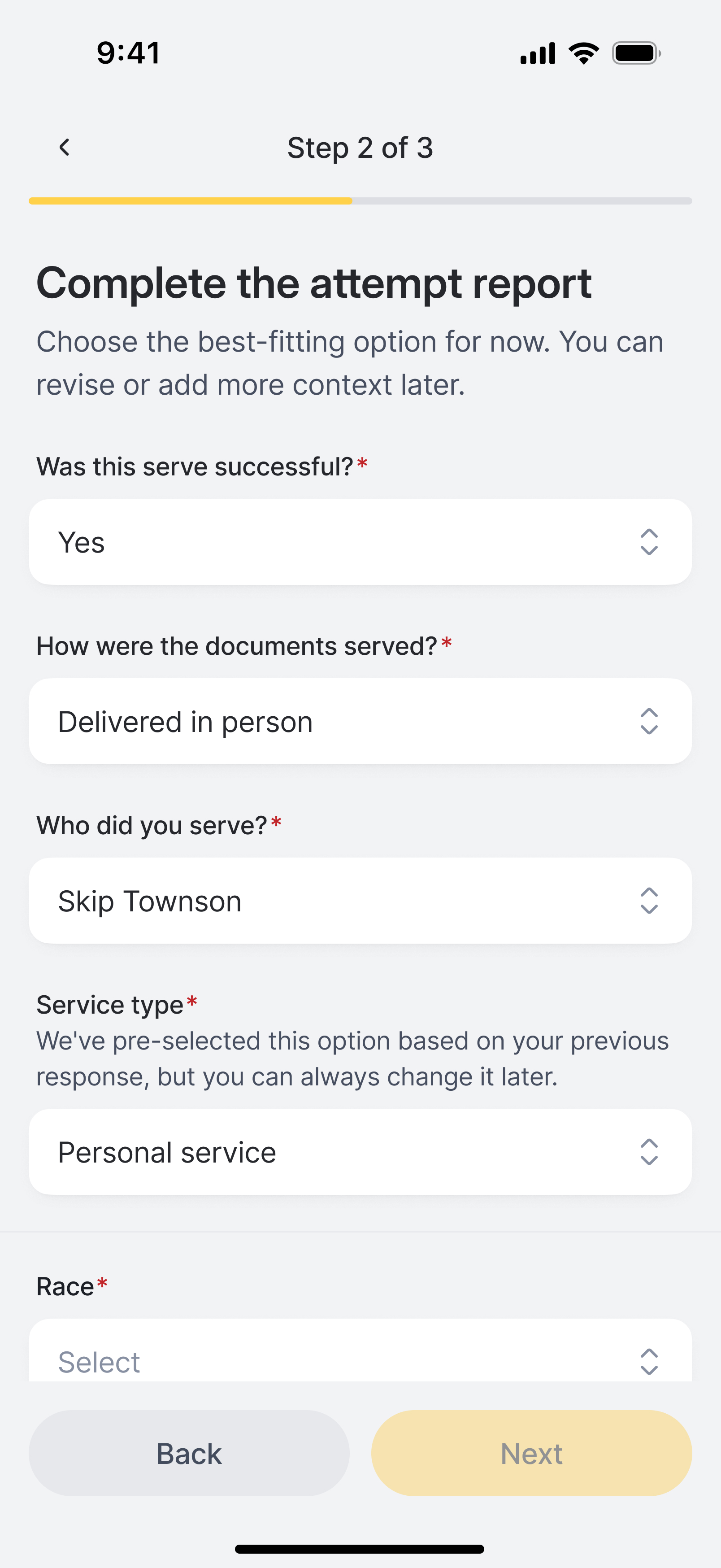
Recording attempts were most sensitive for servers; any change had to feel evolutionary, not regressive.
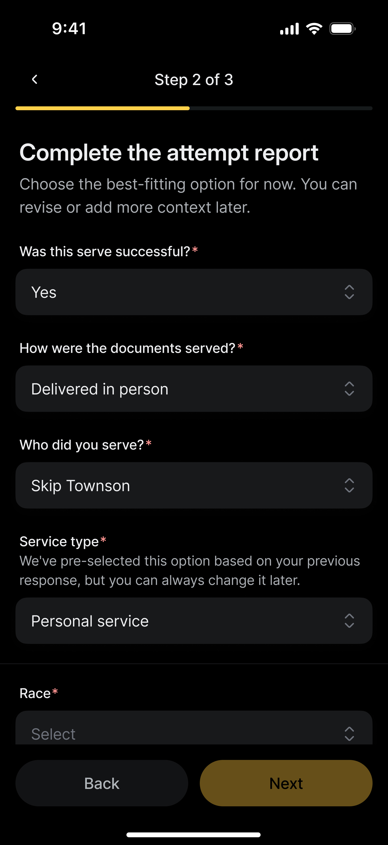
We preserved the three-step structure but shifted to a vertical layout for easier scanning and clearer progression. Inputs appeared progressively: each selection revealed the next step, reducing cognitive load and guiding completion. The rotary dial was replaced with our standard drawer component, aligning this critical workflow with the rest of the design system.
The flow feels familiar, with faster scanning and completion.


Vertical progression reduces effort while preserving familiar workflow.
Impact
The redesign stabilized at-risk partnerships and reduced operational friction across the board.
Ops tickets tied to invalid attempts dropped, and the operational burden that grew with each release began to reverse.
Clearer pathways to key actions reduced submission errors. Faster scanning meant faster job evaluation and improved turnaround times. Less overwhelming interfaces meant fewer mistakes and fewer tickets for ops to manually verify.
Compass established a foundation that could support continued growth without compounding design debt, enabling the team to ship consistently without sacrificing quality.
