
Lob
Lob is a platform enabling businesses to create and send physical mail through an easy-to-use API, turning yesterday’s junk mail into intelligent mail that is personalized, scalable, and automated. With nearly a decade of experience, Lob sought to redefine itself with an identity as cutting-edge as its technology.

Given the rare opportunity to work with a name as short as Lob, it was clear our exploration would wholly embrace the constraints of a three-lettered word, narrowing our focus towards redeveloping Lob’s mark from the ground up.


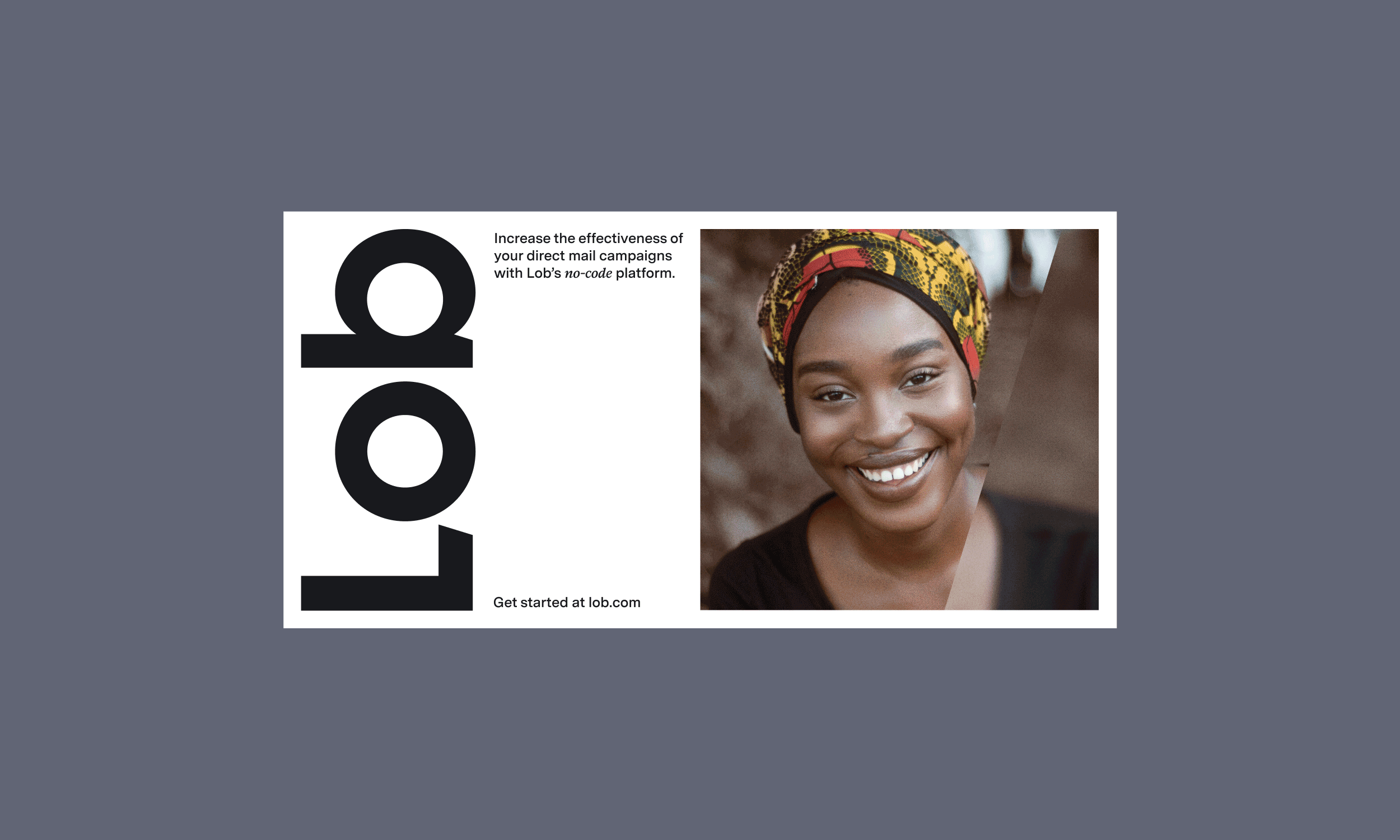
In addition to redrawn letterforms, our solution introduces an element of angularity within the bar and stem of the ‘L’ and ‘b,’ respectively, resulting in a negative space and forward movement that sets the tone and foundation for our visual system.


We developed a color palette in close collaboration with Lob’s design team, opting for core colors that are loud and non-traditional for maximum impact against our otherwise reserved base colors, Cool Paper and Key, and aptly named to reference the brand’s core tenets.
For applications where accessibility precedes impact, we have three variations of our core palette in the form of soft, highlighter, and vivid hues.
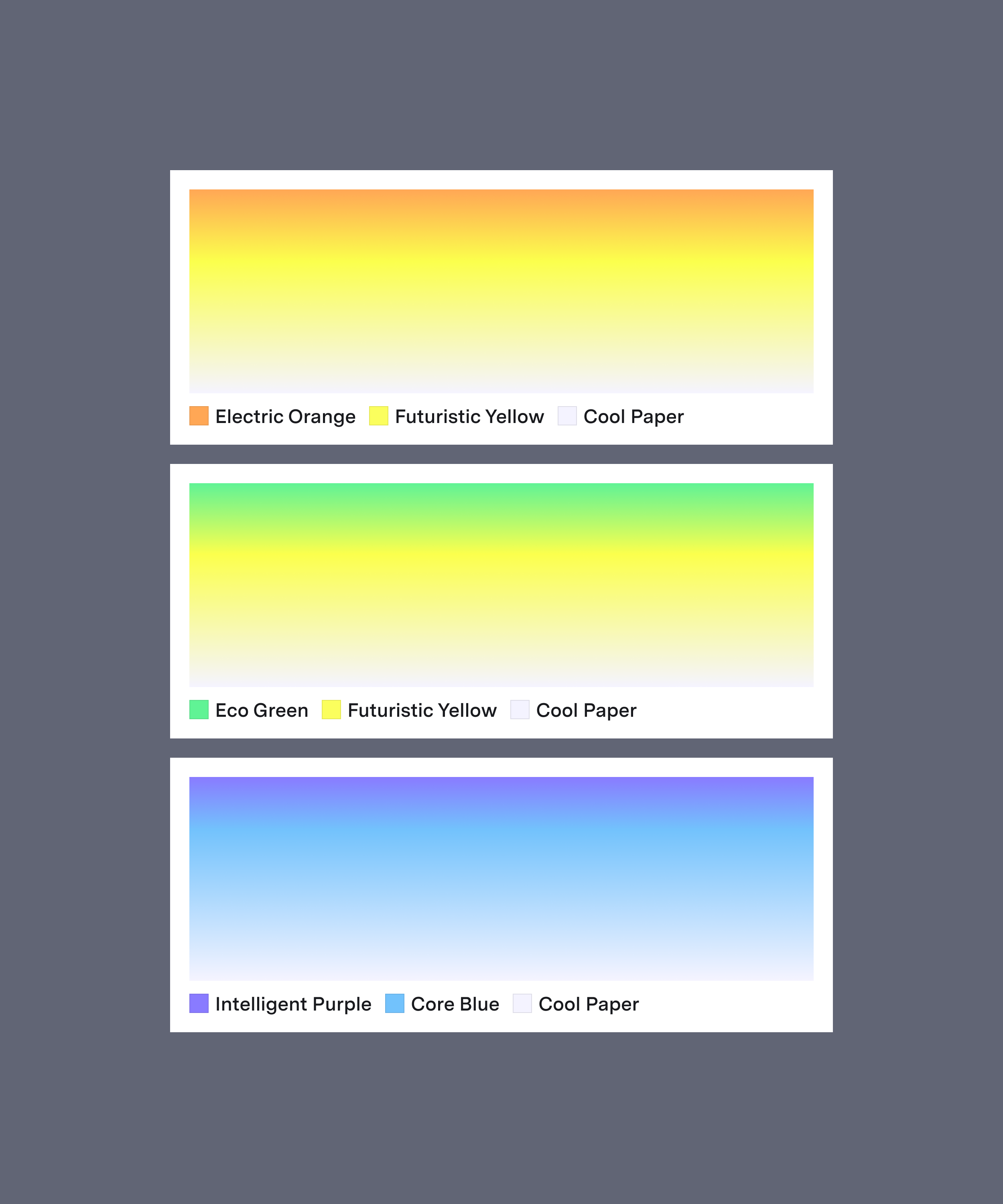

A core component of their visual identity, we created a set of gradients to extend our palette, each with precisely two complementary colors that consistently resolve in Cool Paper. This linearity allows for a seamless color narrative and continuity across applications.
Meticulously drawn using a 24-pixel grid, 2-pixel strokes, and 45º angles where applicable, we crafted a curated library of pixel-perfect icons ready to be used across various brand touchpoints.


Our applications combine the individual components of Lob's identity through an underlying grid framework inspired by print-focused layouts, creating a consistent approach to deliver a variety of expressions across mediums.


To emphasize the power of personalization and break the antiquated stigma around direct mail, we chose to feature images centered on real people with authentic expressions. The repeated angular motif is a nod to Lob’s wordmark and serves as an easily-identifiable framing device.


After months of collaboration, hundreds of iterations, and countless hours of work, we crossed the finish line with a refreshed identity that exudes confidence and is poised to continue redefining direct mail for years to come.
Role: Project & Design Lead
Agency: Unfold